
CASE STUDY 01
FirstView
Designing a Connected Transport Ecosystem for North America's Largest Student Transportation Provider
Designed a connected transportation ecosystem that improved operational visibility, real-time communication, and coordination between school districts, transportation teams, drivers, parents, and students.
Enterprise SaaS • Web Platform • Mobile App • Design Systems • Product Strategy
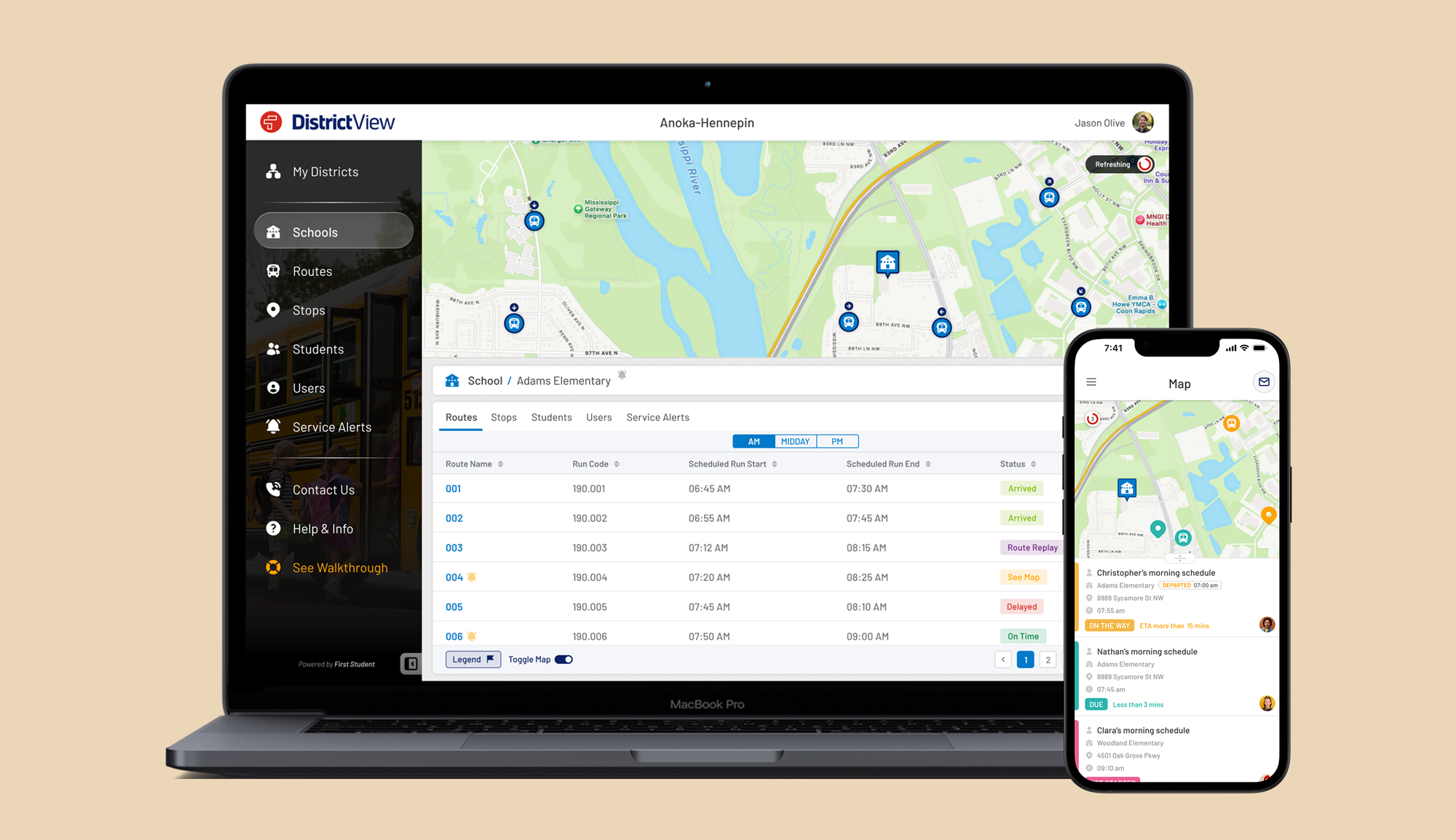
Project Snapshot
Client
First Student North America
Company
uTrack Software Solutions
Product
FirstView Platform
Role
Senior Product Designer (UI/UX Lead)
Timeline
Q1 2017 – Q3 2019
Continued product evolution through Q1 2026
Industry
- Transportation Technology
- Enterprise SaaS
Responsibilities
- Discovery & Research
- Stakeholder Workshops
- Product Strategy
- UX Research
- Interaction Design
- Information Architecture
- User Flows
- Wireframing
- UI Design
- Prototyping
- Design System
- Testing & Iteration
Team
- Product Manager
- Lead Developer
- Backend Engineers
- Frontend Engineers
- QA
- Business Analysts
Context
Building a transportation ecosystem required understanding not only software, but the operational relationships between districts, dispatchers, drivers, parents, and students.
First Student, North America's largest provider of student transportation, partnered with uTrack Software Solutions to modernise how school districts, transportation teams, and parents coordinated daily school transportation.
As part of the product design team at uTrack, I led the UX and product design of the FirstView ecosystem. Working closely with stakeholders, product managers, and engineering teams, I helped transform complex transportation operations into an integrated experience connecting administrators, dispatchers, drivers, parents, and students.
The project began with an intensive discovery phase, including stakeholder workshops in Cincinnati, Ohio, where we mapped operational workflows, identified user needs, and established the product vision before any interface design began.
Platform Scale
School Districts
District and Operational Users
Connected Vehicles
Active Parent Users
Students
Student Journeys / Day
GPS Location Updates / Day
*Platform metrics represent the approximate scale of the production system during the final phase of the FirstView platform in Q1 2026.
The Challenge
School transportation relied on multiple stakeholders making time-critical decisions using fragmented information and disconnected communication channels.
The Transformation
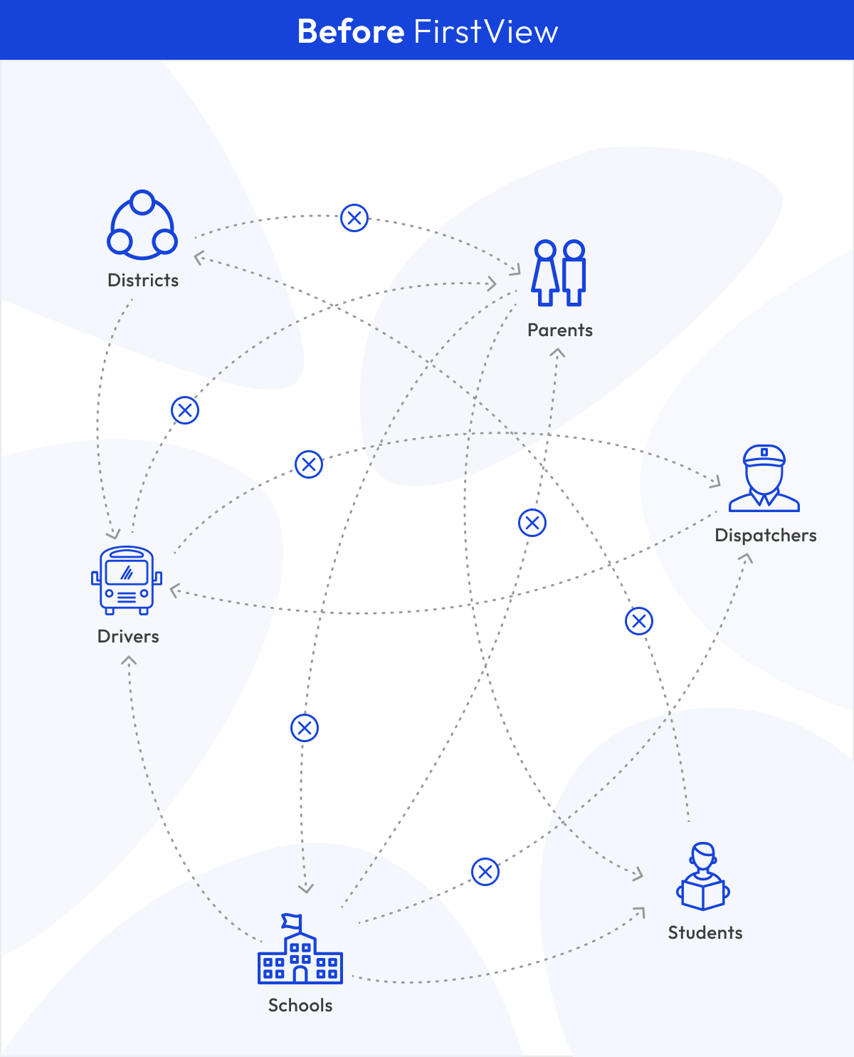
Disconnected operational workflows
Fragmented information
Manual coordination
Delayed communication
Limited operational visibility
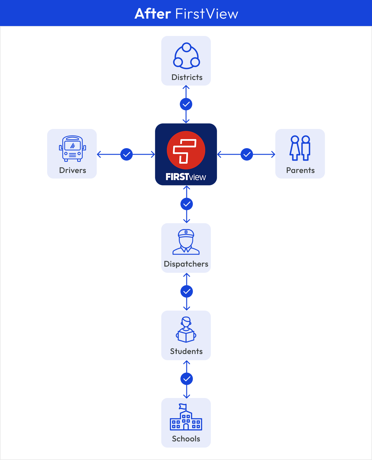
Unified operational ecosystem
Shared source of truth
Real-time coordination
Automated alerts
Live operational visibility
Understanding the Ecosystem
Designing an effective transportation platform required understanding the goals, responsibilities, and information needs of every stakeholder involved in the daily journey.
Understanding Key Stakeholders

District Administrators
Goal
Manage transportation efficiently.
Needs
- Operational visibility
- Fleet management
- Service performance reporting
- District-wide communication

Dispatchers
Goal
Manage live transportation operations.
Needs
- Live GPS visibility
- Route status
- Driver communication
- Service alerts

Drivers
Goal
Stay on schedule.
Needs
- Route information
- Student roster
- Incident reporting
- Service updates

Parents
Goal
Know where their child is.
Needs
- Live bus tracking
- Arrival notifications
- Service updates
- Peace of mind

Students
Goal
Safe transportation.
Needs
- Reliable transportation
- Safe pickup & drop-off
- Route consistency
- Timely arrival

Schools
Goal
Coordinate arrivals and departures.
Needs
- Student attendance visibility
- Arrival notifications
- Schedule coordination
- Incident awareness
Discovery
Before a single screen was designed, our team travelled from Ireland to Cincinnati, Ohio, to spend three days working alongside First Student's leadership and operational teams. The goal wasn't to validate interfaces, it was to define the future of the product together.
Understanding the Business
We aligned on business objectives, reviewed existing workflows, and explored how different stakeholders managed school transportation across districts.
Stakeholder Workshops
Collaborative workshops with product owners, operational leaders, and technology teams helped us challenge assumptions, prioritise ideas, and refine the product vision.
Operational Mapping
Together we explored user roles, information architecture, route logic, dashboard behaviours, ETA messaging, permissions, and reporting requirements before any interface design began.
Product Vision
By the end of the workshops, dozens of ideas had been refined into a shared product strategy, establishing the foundation for the platform architecture, user experience, and design work that followed back in Ireland.
Discovery Artefacts
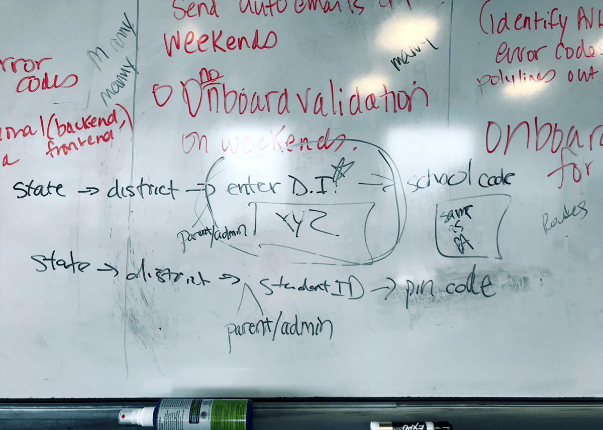
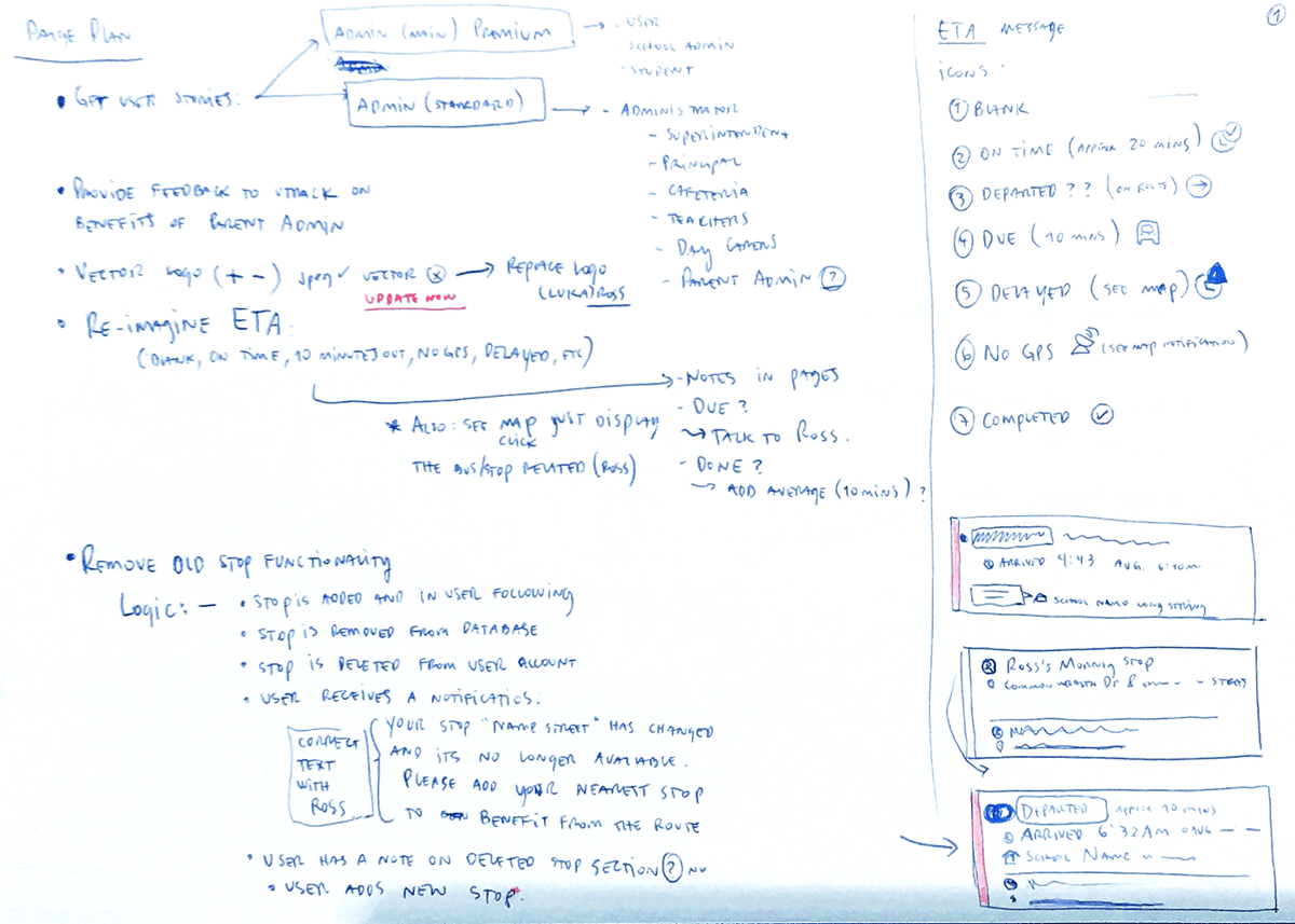
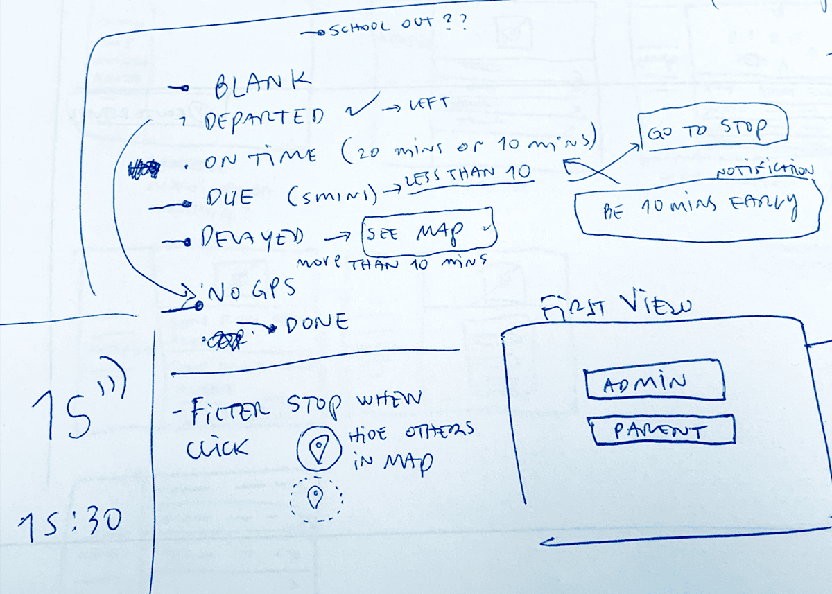
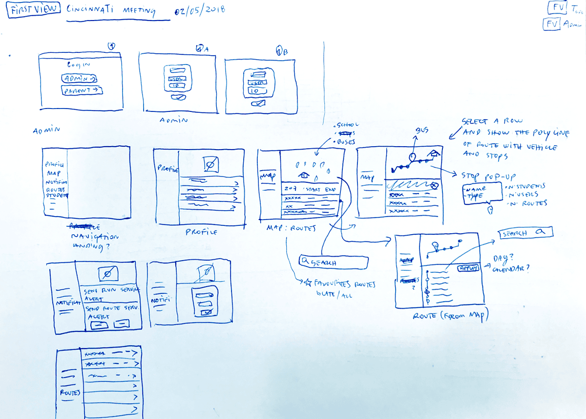
Rather than polished deliverables, these are original workshop notes, whiteboard sessions, and concept sketches captured during our discovery meetings with First Student in Cincinnati.
These original workshop materials capture how the product evolved from early conversations and whiteboard discussions to interface concepts that later became production features. They document the collaborative process behind defining FirstView's architecture, workflows, and user experience.
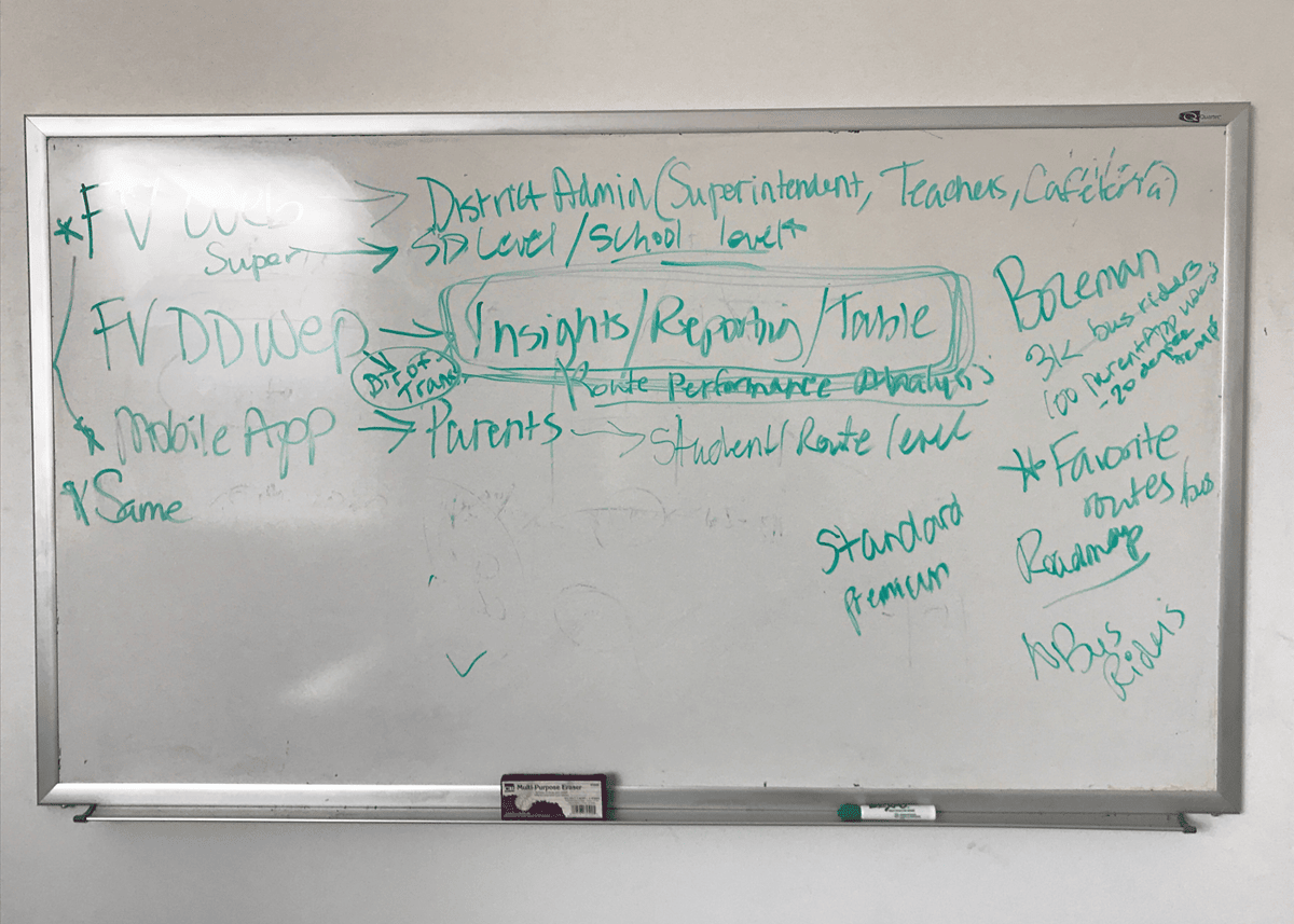



Shared Product Vision
Three days of workshops transformed dozens of conversations into a shared vision for the platform. Instead of jumping directly into interface design, we aligned on the people we were designing for, the operational challenges we needed to solve, and the capabilities the platform would require from day one. This shared understanding became the foundation for every design decision that followed.
People first
Understanding the needs of parents, school administrators, dispatch teams and drivers before defining features.
Operational clarity
Mapping districts, routes, permissions, reporting and communication into a coherent service ecosystem.
Product opportunities
Identifying opportunities beyond live bus tracking, including messaging, alerts, reporting, permissions and future platform capabilities.
Shared alignment
Creating a common language between stakeholders, engineering and design before wireframes or visual design began.
One of the biggest challenges wasn't collecting requirements; it was translating ambitious business ideas into solutions that were technically feasible, operationally practical, and genuinely valuable for users.
From Vision to Product
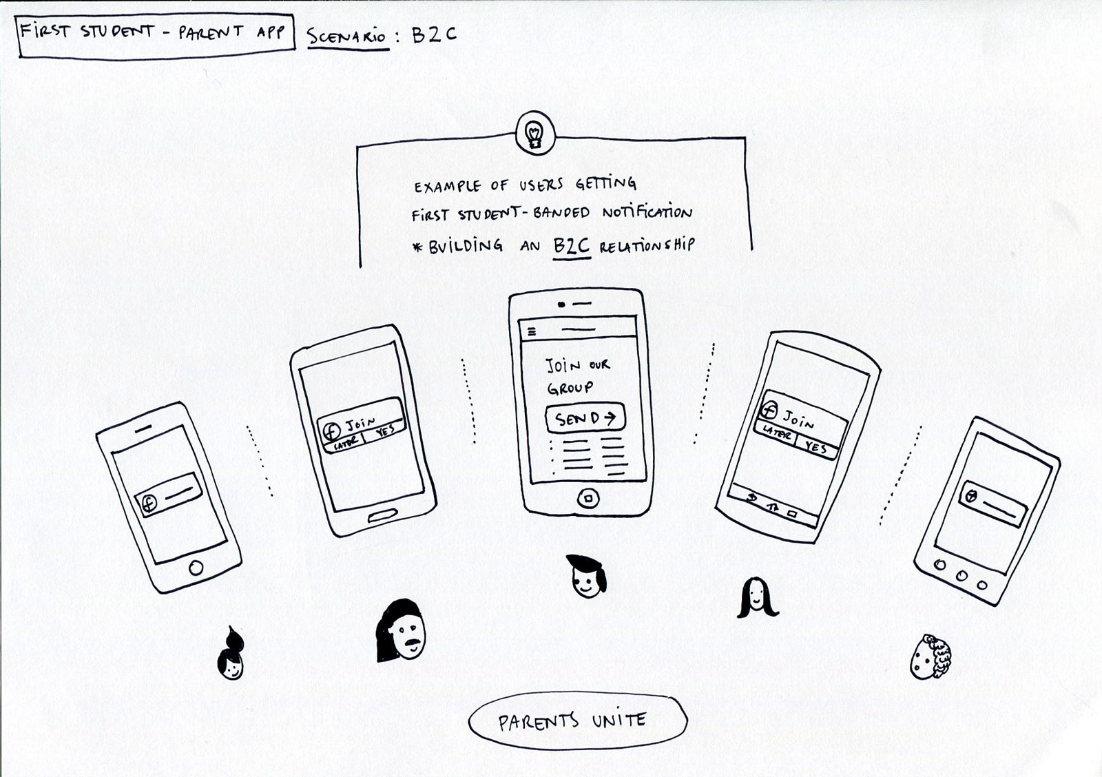
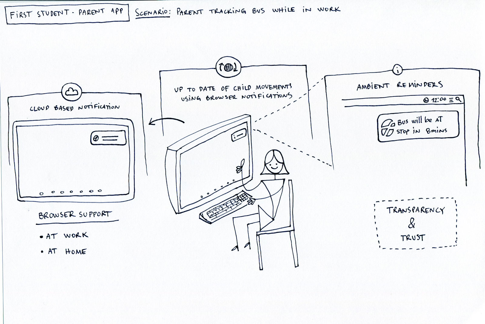
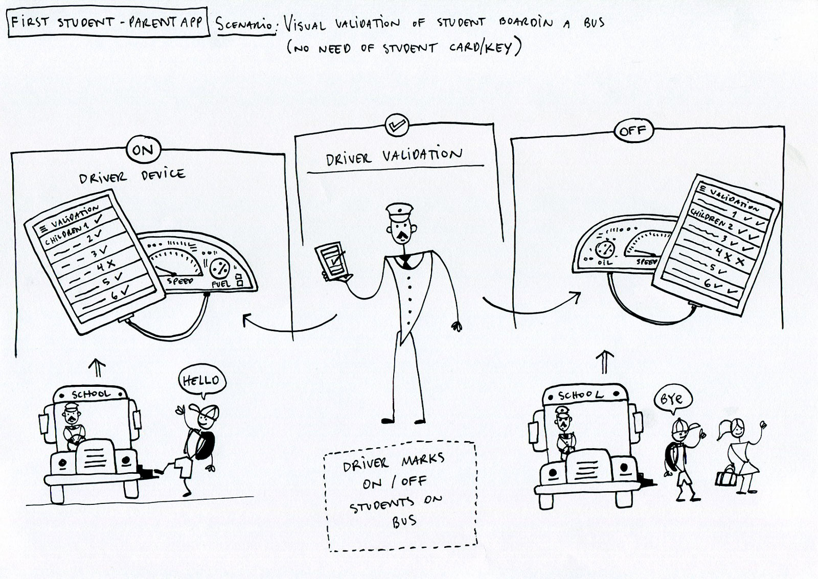
With the product vision aligned, I explored how the platform could improve everyday experiences across the school transportation ecosystem. Rather than beginning with polished interface designs, I created illustrated scenarios that helped stakeholders visualise future interactions, validate ideas early, and discuss product opportunities from multiple perspectives.
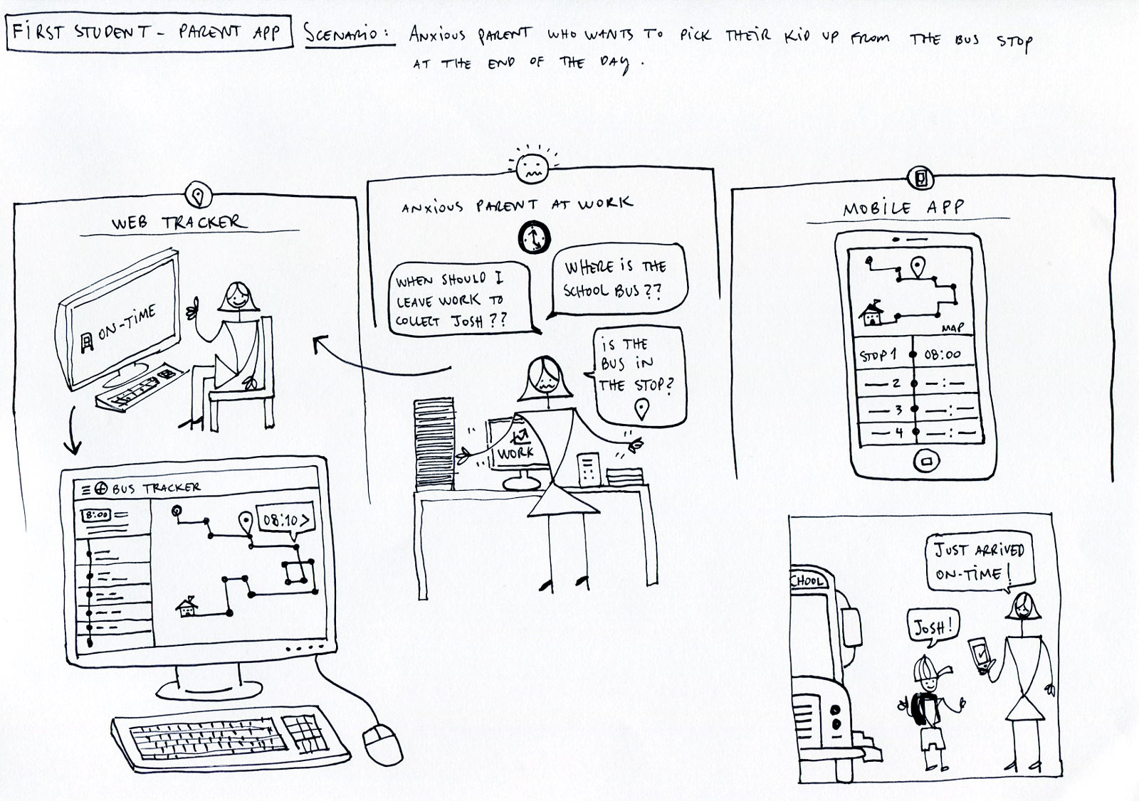
Scenario: Anxious parent who wants to pick their kid up from the bus stop
One of the earliest concepts explored the emotional problem behind the platform: giving parents confidence that they knew where their child was and when to leave for the bus stop. This scenario became the guiding principle behind many of the platform's real-time tracking and notification features.
Parent Experience

School Operations


Driver Experience


Client Requirements
The discovery workshops concluded with a shared understanding of the platform's goals and the capabilities required for the first release. Working closely with First Student's operational teams, we translated business priorities into a structured set of functional requirements that established the foundation for design, engineering, and future product releases.
Feature Categories
🚌 Fleet Operations
Manage routes, vehicles, drivers and live operations.
👪 Parent Experience
Real-time tracking, notifications and route information.
🏫 District Administration
Student management, schools, permissions and reporting
💬 Communication
Messaging, alerts and ETA updates.
📊 Reporting
Operational dashboards and analytics.
🔐 Security
Authentication, permissions and account management.
Prioritisation
📡 Live Operations
Support real-time visibility of vehicles and routes.
💬 Communication
Reduce uncertainty through timely parent notifications.
📈 Scalability
Design workflows capable of supporting hundreds of districts.
✨ Ease of Adoption
Keep interfaces simple for school administrators with varying technical experience.
Transition
Before designing individual interfaces, the platform itself needed structure. Information architecture established how users, permissions, and operational workflows connected across the entire ecosystem.
Version 1.0 Requirements
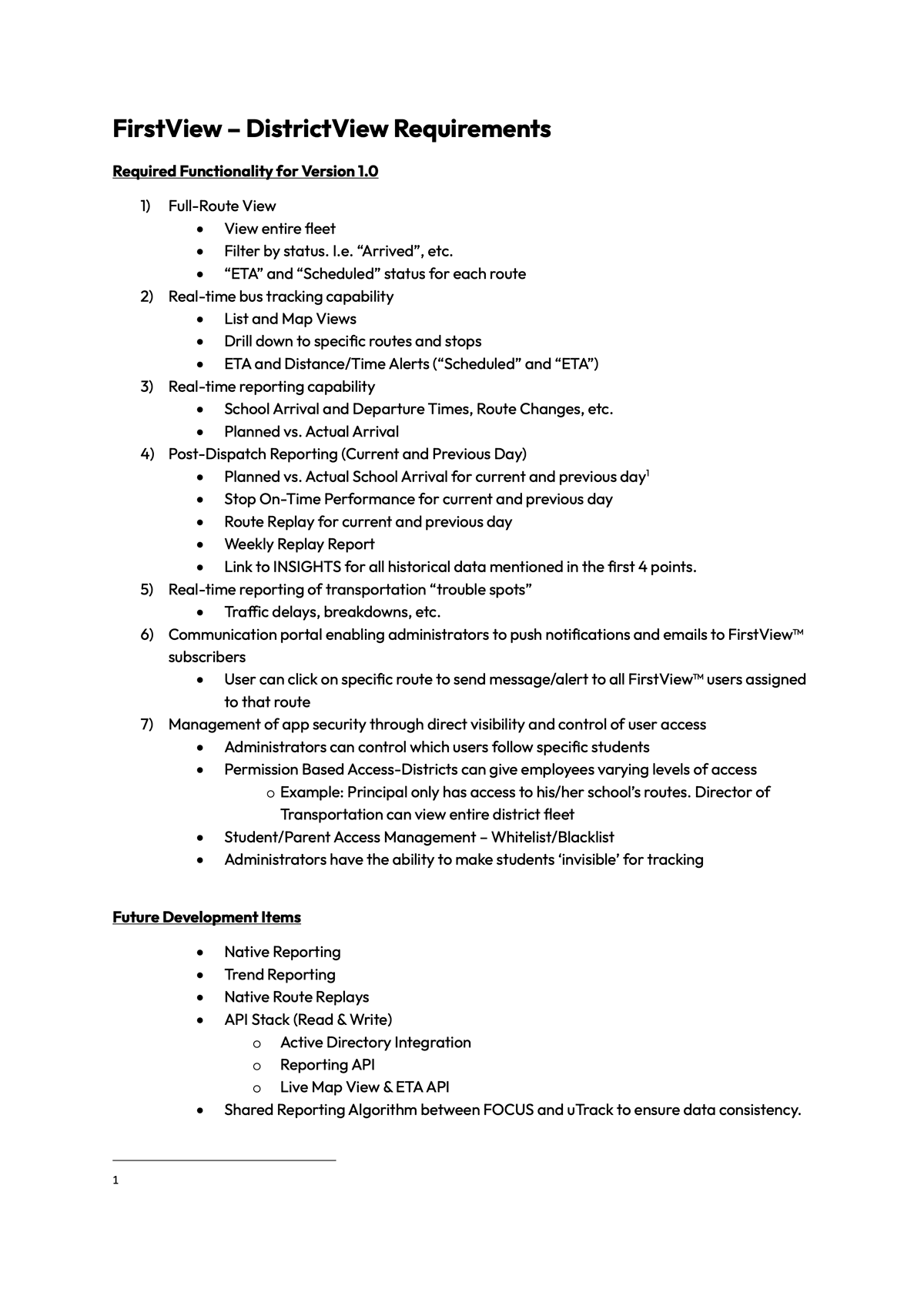
Selected page from the original Version 1.0 functional specification used by design and engineering during planning.
Information Architecture
With the product scope defined, the next challenge was organising a complex platform into a logical structure. Before exploring interfaces, we established the information architecture, navigation model, and user permissions that would support the day-to-day operations across districts, schools, drivers, and parents.
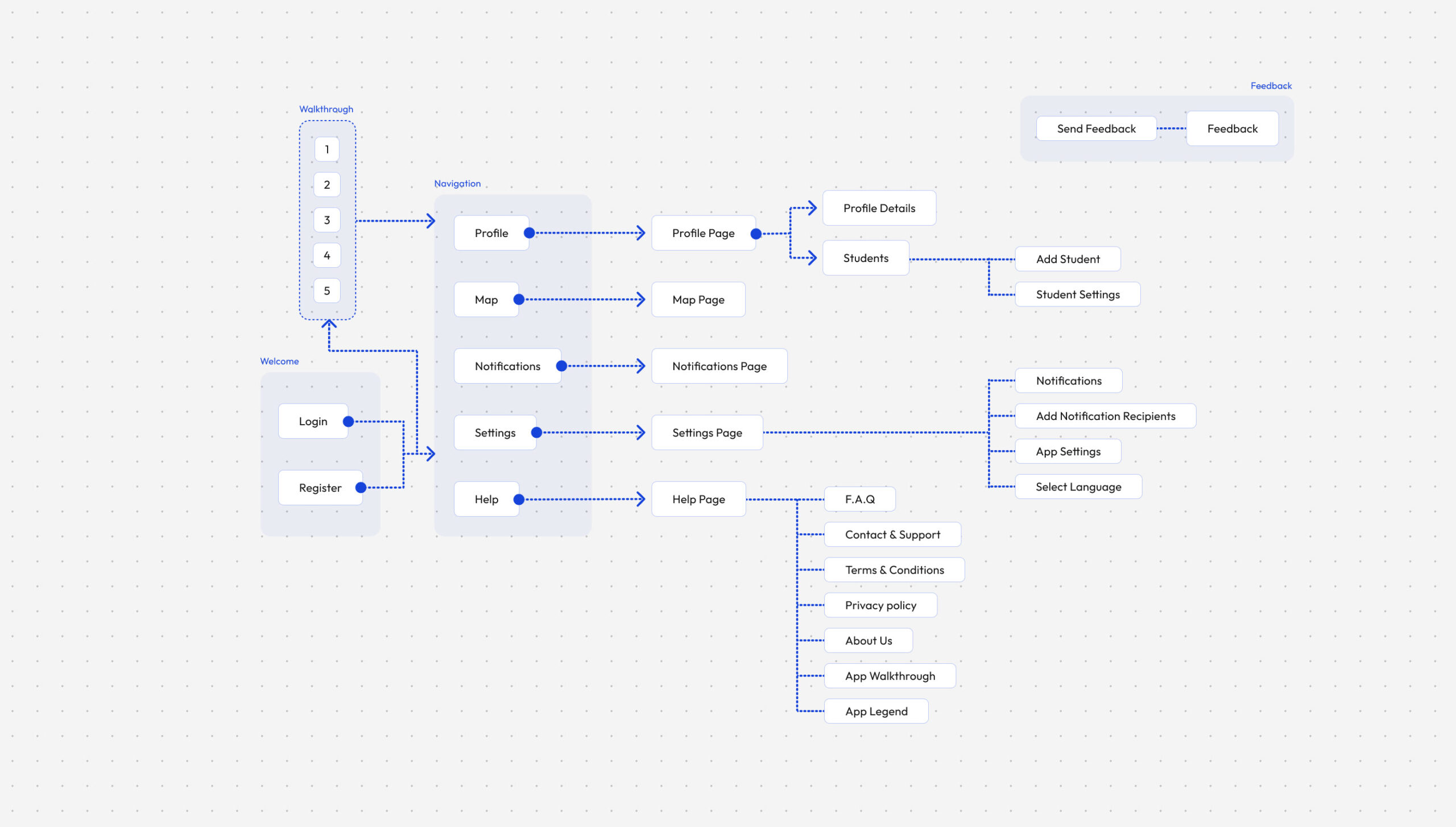
FirstView - Platform Architecture
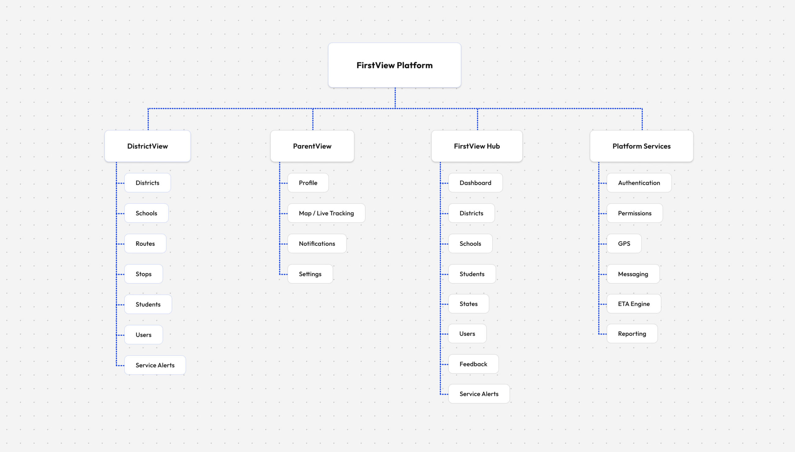
Architecture Principles
Role-based navigation
Each user only has access to the tools and workflows relevant to their responsibilities.
Scalable hierarchy
Districts, schools, routes, vehicles, and students follow a predictable organisational model.
Operational efficiency
Frequently used actions were designed to remain accessible within one or two interactions.
Consistency
Shared navigation patterns reduce learning time across different modules.
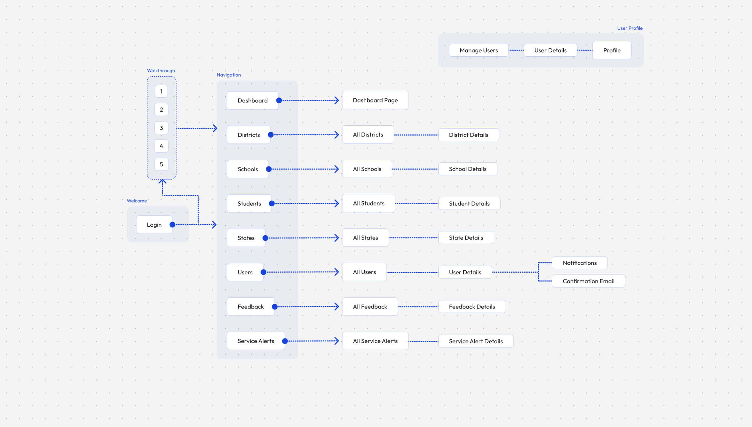
Core Navigation
DistrictView - District Administration
ParentView - Parent Experience
FirstView Hub - Operations Management
Transition
A clear platform structure revealed the individual journeys that operators and parents would perform every day. Those journeys became the blueprint for every screen that followed.
Key User Journeys
With the platform architecture in place, we mapped the journeys administrators and parents would perform every day. Each workflow was refined to minimise friction before visual exploration began.
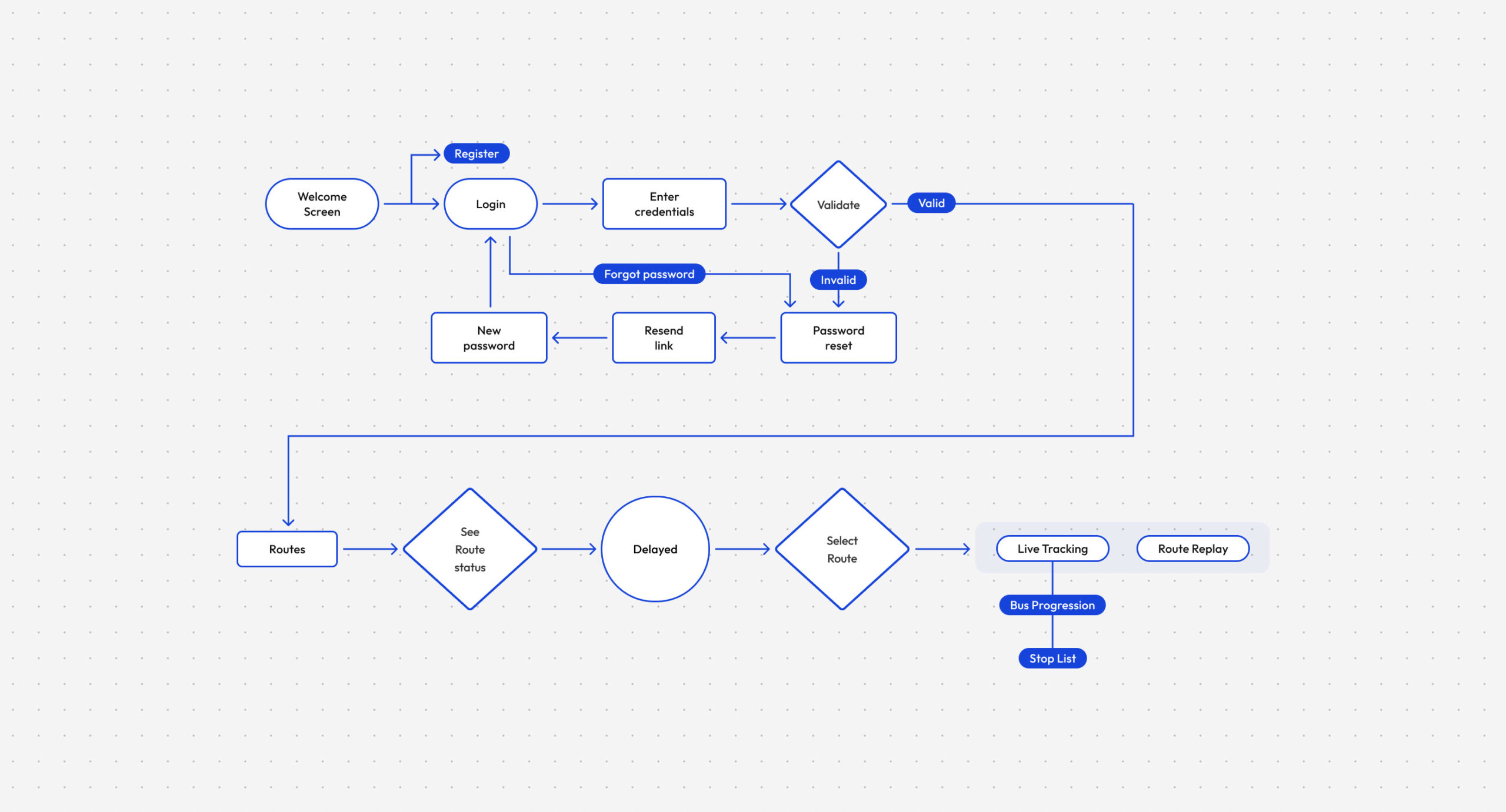
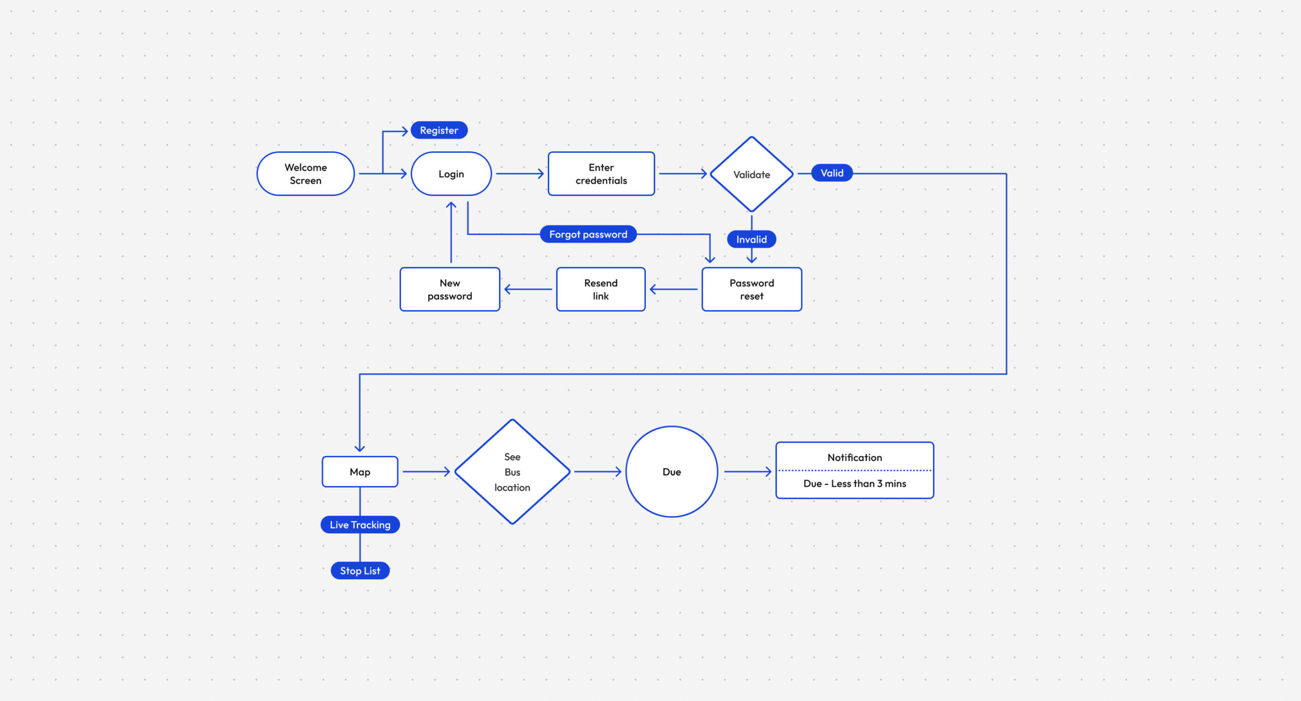
Representative User Journeys
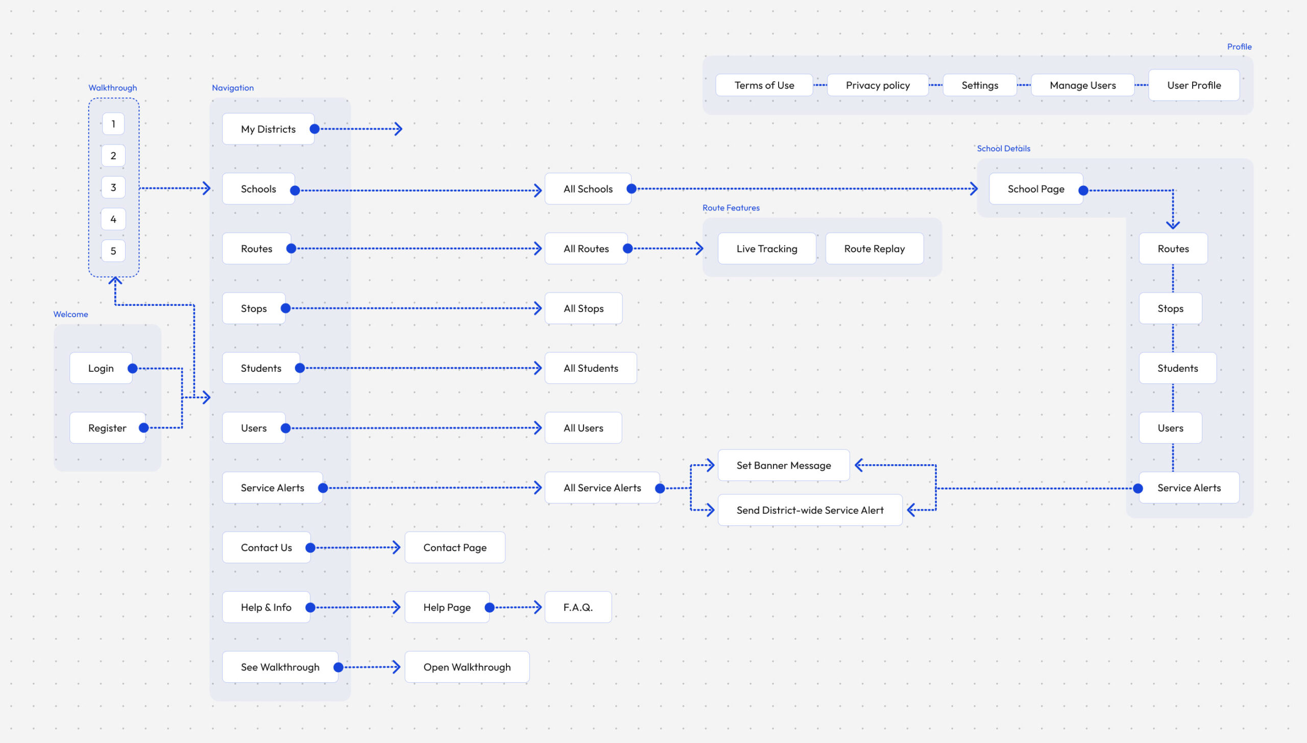
District Administrator Journey
District administrators begin by authenticating into the platform, selecting their district, and accessing the operational modules used to manage schools, routes, students, users, and service alerts. The journey prioritises quick access to frequently used tools while supporting secure administration across multiple districts.

Route Operations
Route operators needed immediate access to the live status of every school route throughout the day. This journey focuses on identifying delays, selecting active routes, and accessing live tracking or historical route replays to support operational decisions and parent communications.
Parent Journey
Parents primarily interact with the platform to understand where their child's bus is and when it will arrive. The journey was designed to minimise uncertainty by providing real-time vehicle tracking, stop information, and timely notifications as the bus approached the assigned stop.
Transition
Once the core journeys had been mapped, attention shifted from understanding workflows to refining the interactions within them.
Flow Design Principles
Task-focused
Each flow was designed around a real operational task rather than individual screens.
Minimise friction
Frequently repeated workflows were kept short to reduce administrative effort.
Clear decision points
Validation and branching paths were introduced only where necessary.
Consistent behaviour
Similar actions followed predictable interaction patterns across the platform.
Every journey was designed around a real operational task, not around individual screens.
Designing the Tracker Experience
Once the primary journeys had been defined, the focus shifted towards translating operational workflows into tangible interfaces. Instead of designing isolated screens, the process focused on the complete journey parents followed while tracking their child's bus.
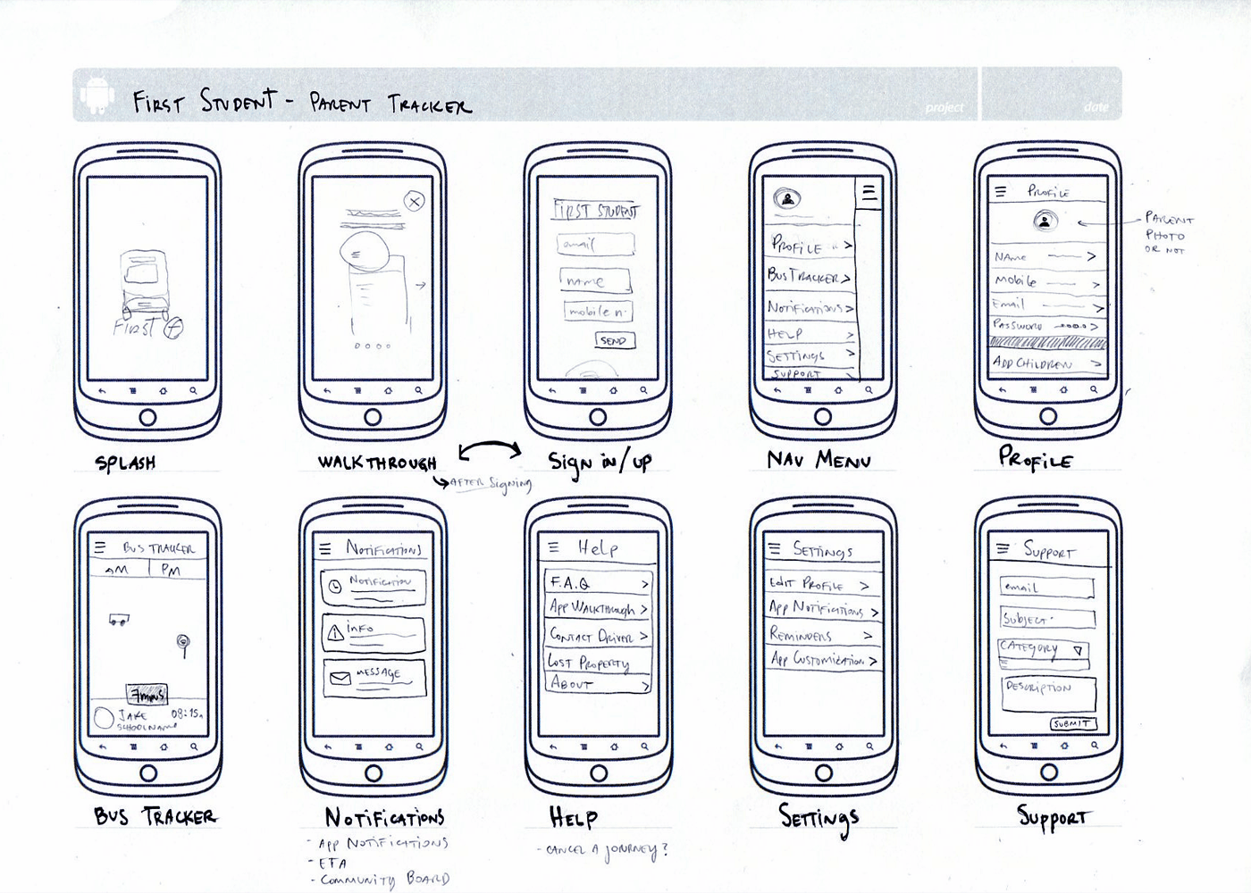
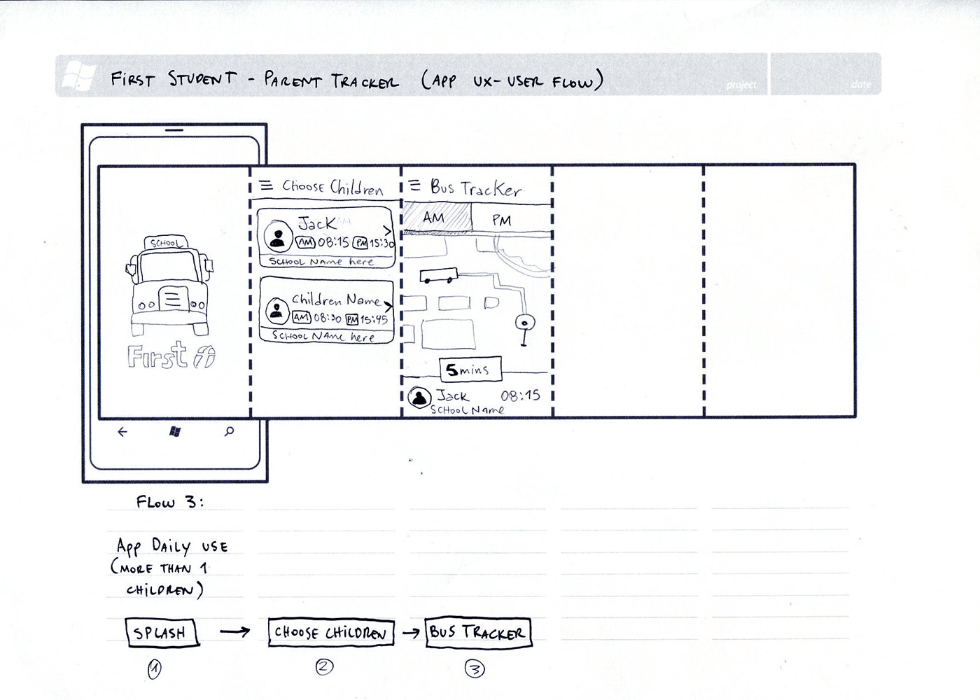
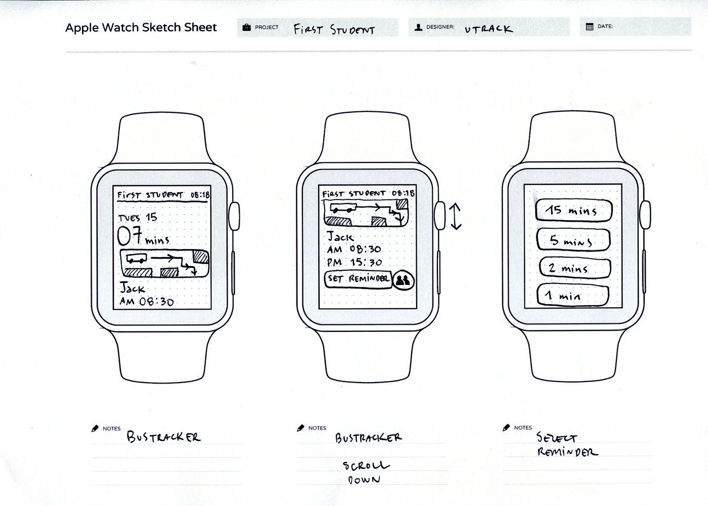
Hand Sketches
Exploring the core experience through low-fidelity sketches allowed rapid experimentation with navigation, onboarding, account management, notifications, and the tracker before committing to digital wireframes.


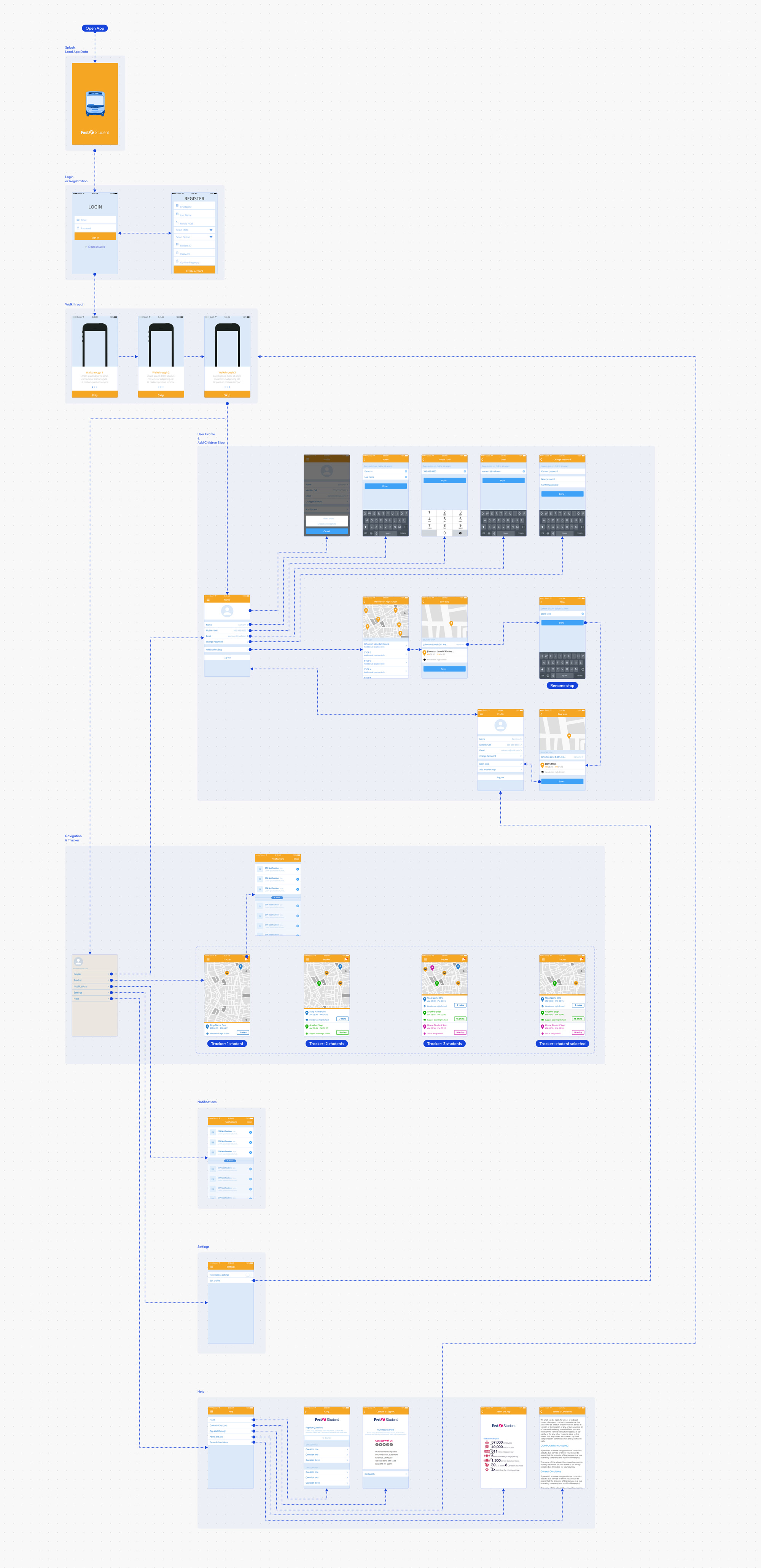
Building the Information Flow
Once the initial concepts had been validated, the experience was translated into interconnected wireflows that mapped every primary interaction, from onboarding through to live vehicle tracking. These wireflows became the foundation for validating navigation, identifying missing states, and aligning development before visual design began.

Key Design Decisions
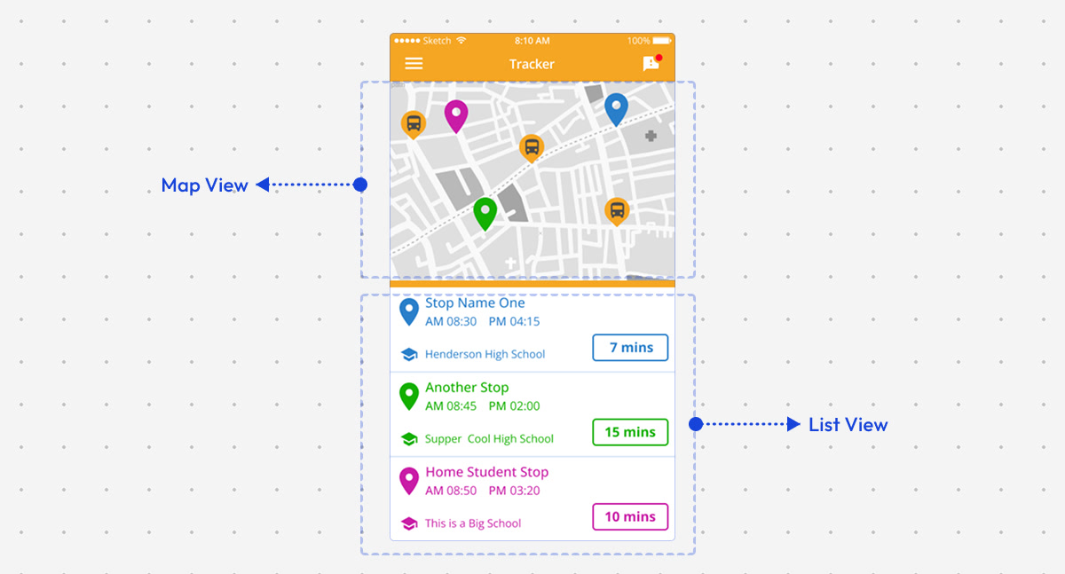
The tracker was the core experience of the Parent App, enabling parents to monitor school buses in real time and stay informed throughout each journey. While the underlying functionality remained consistent, the challenge was finding the clearest way to present live information without overwhelming users. Through multiple rounds of wireframing and interface exploration, I tested different layouts, information hierarchies, and interaction patterns before refining the final experience.
How should parents monitor multiple children?
One of the earliest challenges was designing an experience that worked equally well for parents with one child and those managing several children travelling on different routes. Rather than creating separate tracking experiences, I explored a flexible interface that could scale naturally from a single student to multiple active journeys. Different layouts were tested to balance simplicity, quick access, and clear separation between each child's information without adding unnecessary complexity.

Where should arrival information be prioritised?
Parents primarily opened the app to answer a single question: "When will the bus arrive?" Several layouts explored different placements for the estimated arrival time (ETA), testing whether it should be anchored to the map, displayed alongside each stop, or highlighted as the primary call-to-action. The final direction prioritised ETA as the most prominent element while maintaining sufficient context around the vehicle's location and upcoming stop.

What information matters most at each stop?
Each stop contained multiple pieces of information, including the stop name, arrival time, route details, vehicle position, and tracking status. The challenge was deciding what deserved immediate attention and what could remain secondary. Through iterative wireframes, I refined the visual hierarchy to surface the most actionable information first while keeping additional details easily accessible when required.

Should the map or the route list take priority?
The tracker needed to support two complementary mental models. Some parents preferred watching the vehicle move on the map, while others simply wanted to know the next stop and expected arrival time. Different layouts explored the balance between geographic context and structured route information, leading to an interface where both views worked together without competing for attention.
Transition
After validating interaction patterns through low-fidelity exploration, the focus moved towards visual refinement and interface consistency.
From Flows to Interfaces
With the core user journeys defined, the next step was translating workflows into interface concepts. Wireframes allowed the team to validate layout, navigation, and interaction patterns before investing in visual design, ensuring every screen supported real operational tasks and user needs.
DistrictView Wireframes
Administrative Platform

ParentView Wireframes
Mobile Experience
What We Validated
Information hierarchy
Every screen was structured to surface the most relevant information first, helping users make faster decisions during daily operations.
Navigation patterns
Wireframes were used to refine how users moved between modules, ensuring frequent tasks remained predictable and efficient.
Interaction design
Alternative layouts and workflows were explored to validate key interactions before committing to visual design.
Consistency at scale
Shared layouts, reusable components, and common interaction patterns established a scalable foundation across DistrictView and ParentView.
Visual Design
Once the core workflows had been validated through user flows and wireframes, the focus shifted to crafting a visual language that balanced clarity, accessibility, and operational efficiency. Every visual decision balanced clarity, accessibility, and consistency across desktop and mobile experiences.
Design Evolution
Wireframe → Early Concept → Final Interface
DistrictView Dashboard
The DistrictView dashboard evolved from a functional wireframe into a comprehensive operational workspace. Early concepts explored navigation, module hierarchy, and data density before introducing a clearer visual language that improved scanability while supporting complex day-to-day administration.
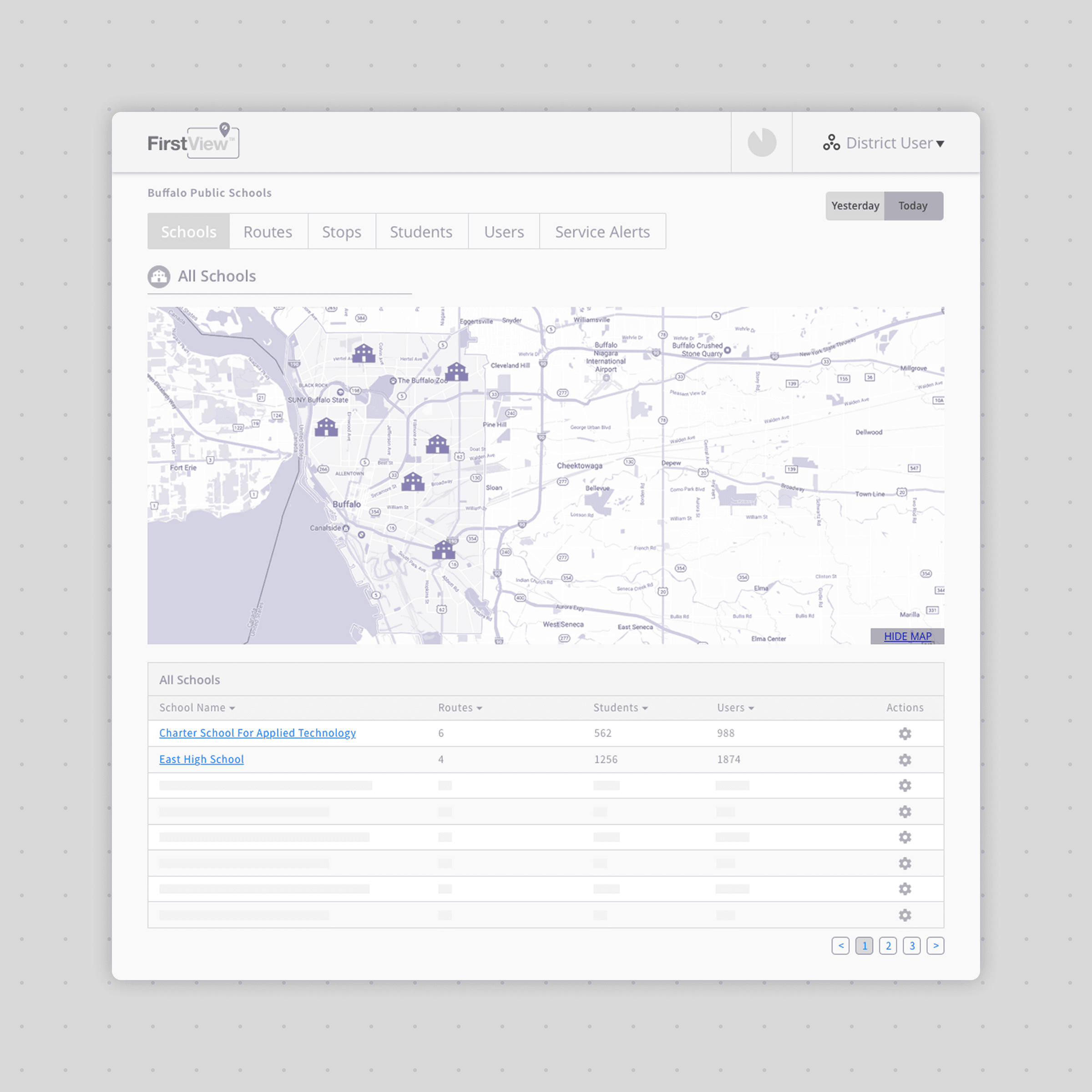
Wireframe
Established layout and navigation

Early Concept
Introduced hierarchy and branding
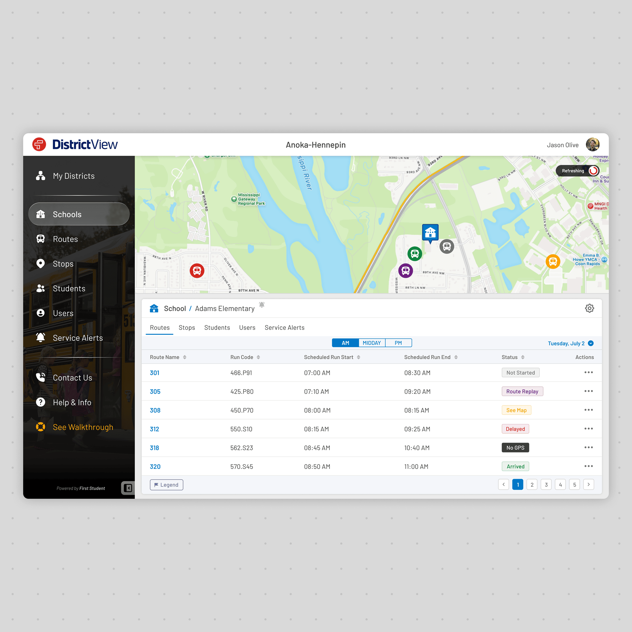
Final Interface
Optimised for daily operational use
ParentView Tracker
The tracker was refined through multiple iterations focused on clarity, accessibility, and real-time awareness. Visual hierarchy, colour usage, and information placement were continuously adjusted to ensure parents could understand vehicle location and arrival times within seconds.
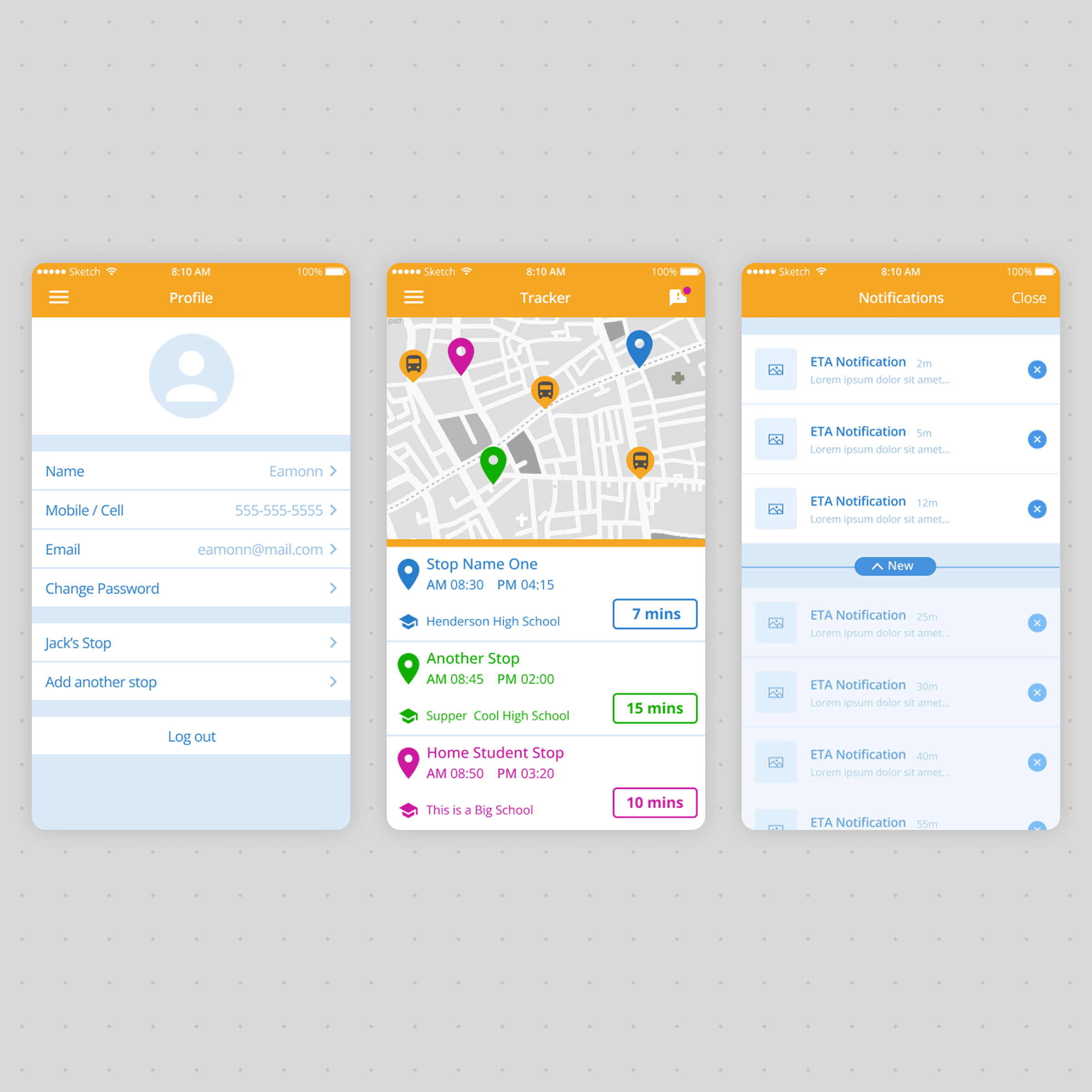
Wireframe
Defined user structure
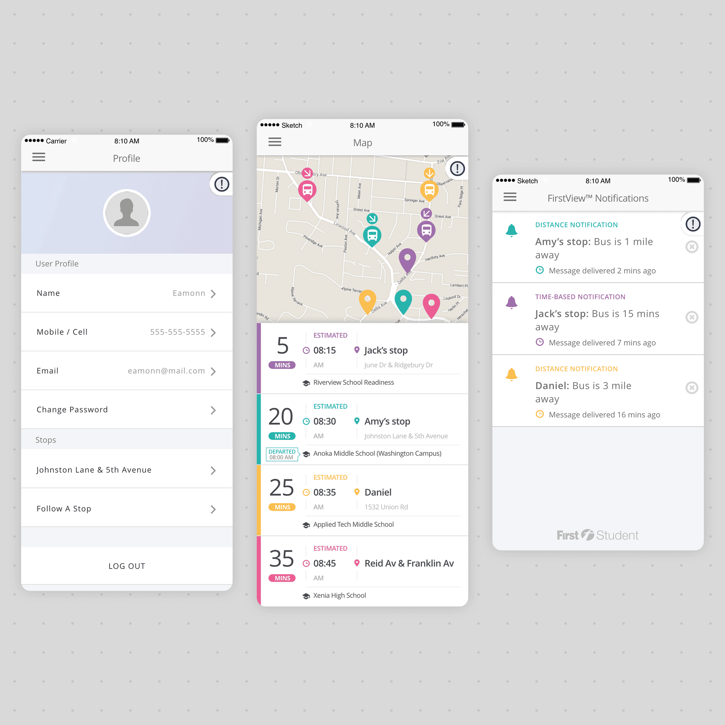
Early Concept
Explored layout and visual language
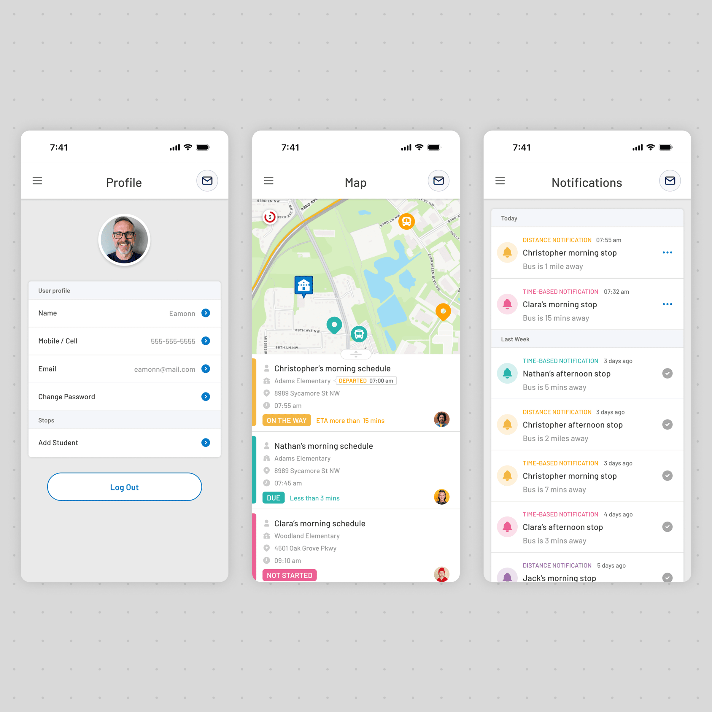
Final Interface
Optimised for Mobile Users
FirstView Hub
As the platform expanded, the Hub became the central management environment connecting districts, users, notifications, and operational services. Visual refinement focused on creating consistency across modules while maintaining flexibility for future platform growth.
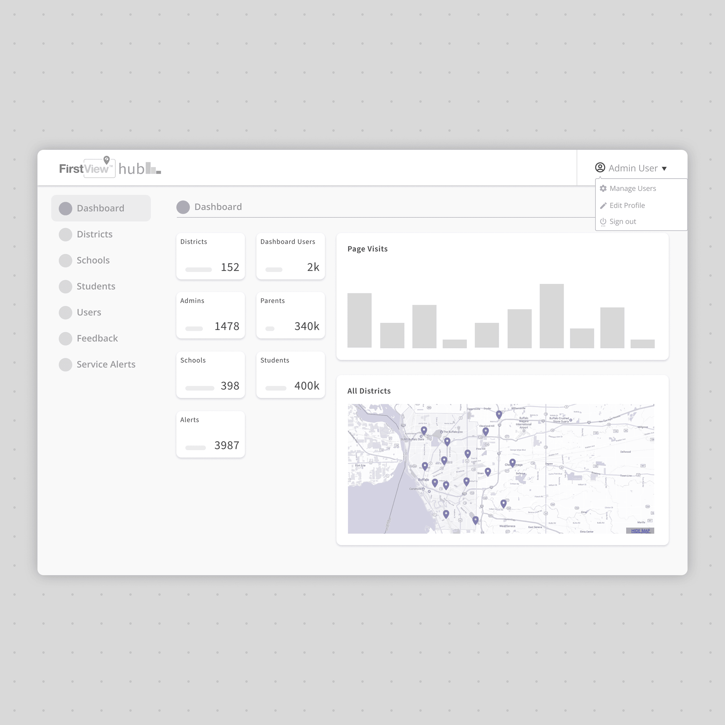
Wireframe
Established module structure
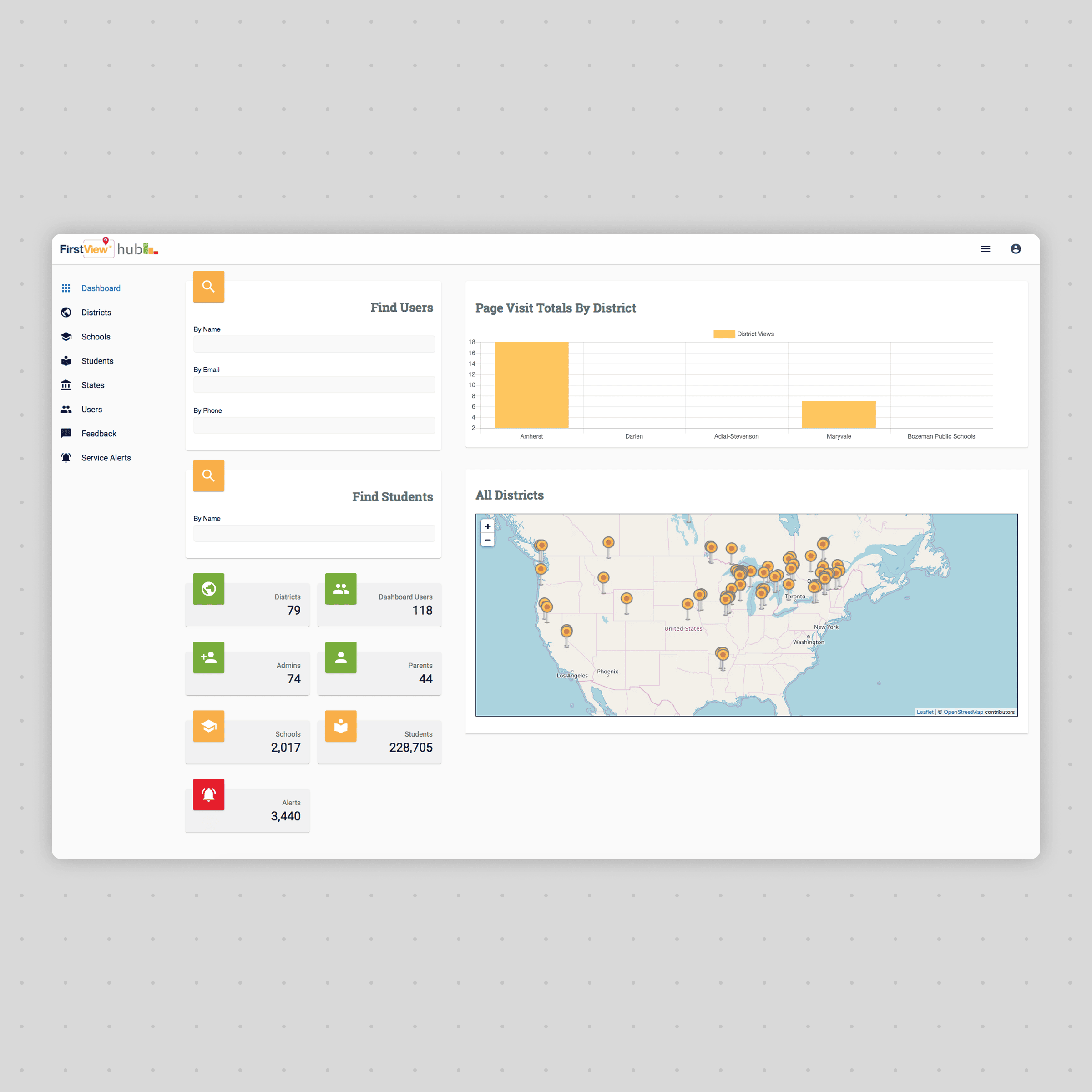
Early Concept
Refined visual hierarchy
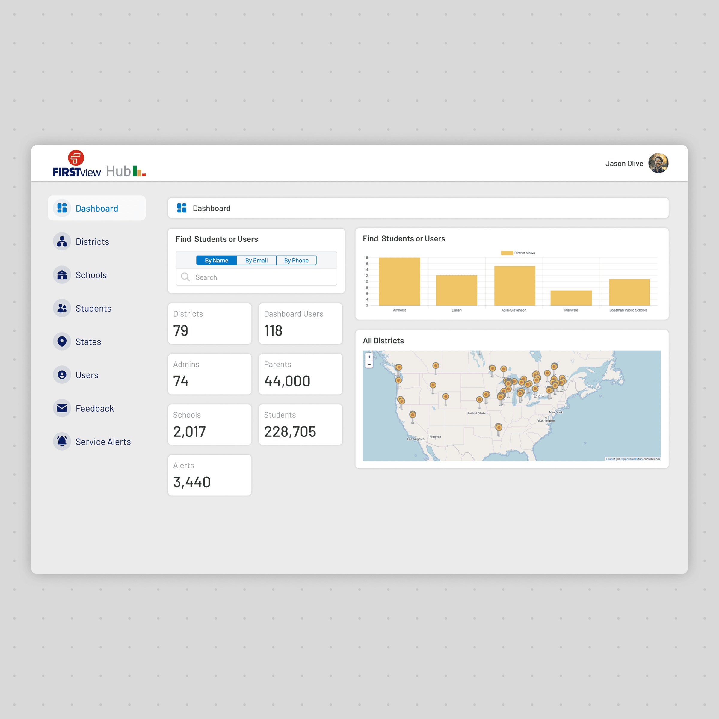
Final Interface
Optimised for daily operational use
Design System
As FirstView expanded across products, users, and operational scenarios, consistency became increasingly important. A shared design system was established to unify visual language, interaction patterns, and reusable components across desktop and mobile experiences. This reduced design effort, improved usability, and created a foundation that could scale as the platform evolved.
Design System Principles
Consistency
Shared components reduced visual and interaction differences across products.
Accessibility
Typography, colour contrast, and spacing improved readability across desktop and mobile.
Scalability
Reusable patterns allowed new features to be introduced efficiently.
Efficiency
Standardised UI accelerated design, development, and future maintenance.
Foundations
Colours
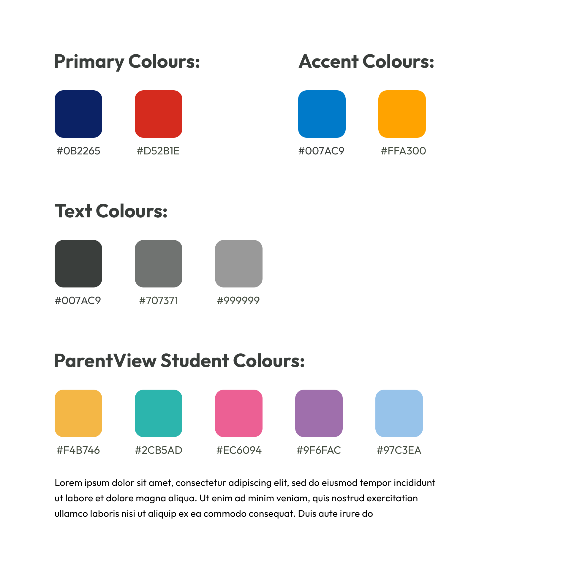
A restrained colour palette defined hierarchy while providing distinct visual cues for operational status and student identification.
Typography
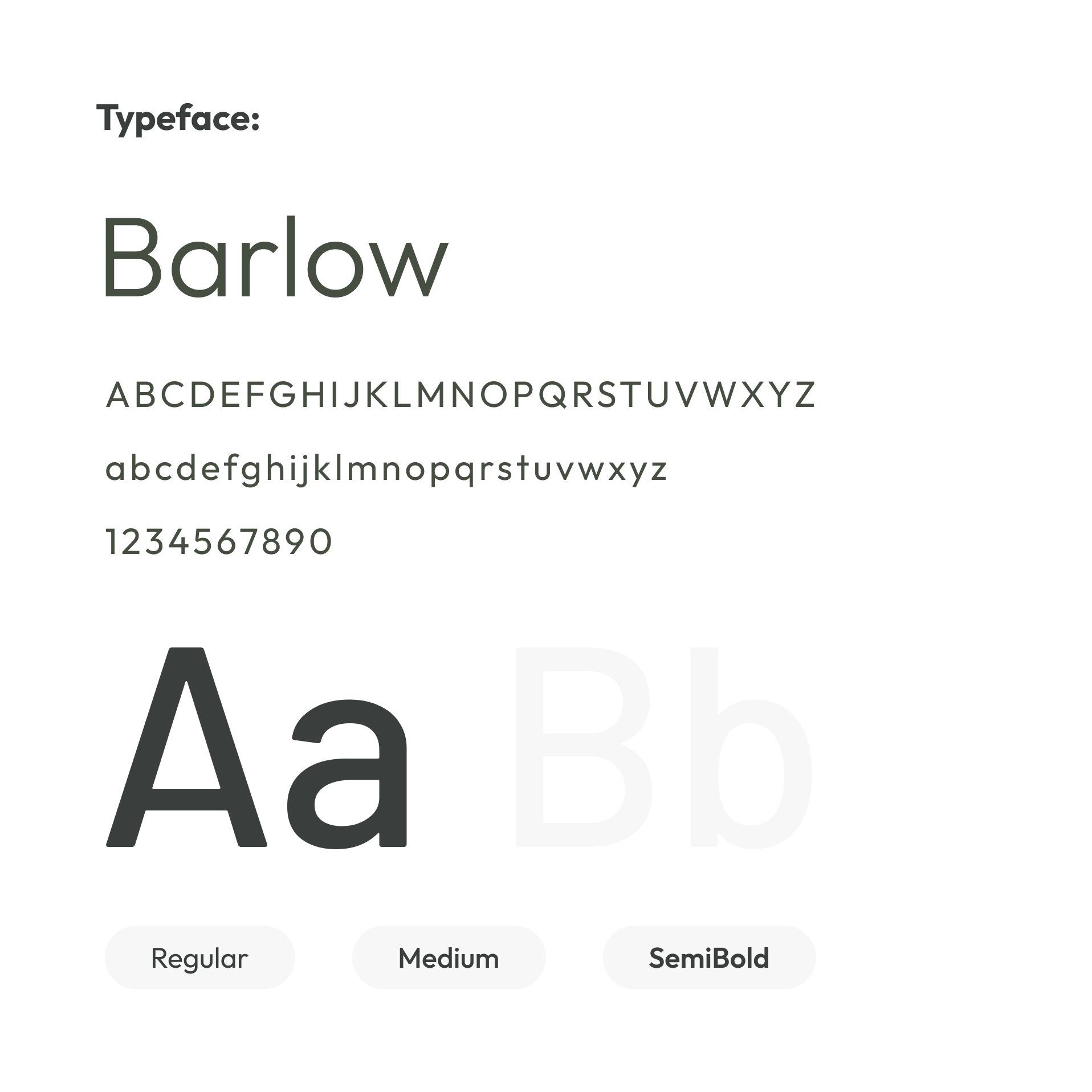
A consistent typographic scale improved readability across dense operational dashboards and mobile interfaces.
Core UI
Icons
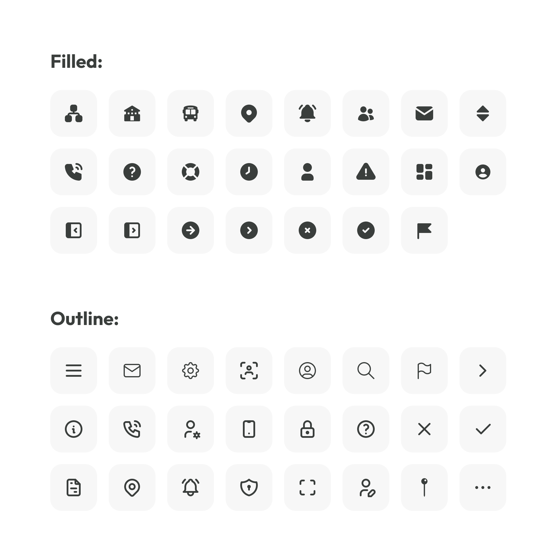
A shared icon set simplified navigation while supporting rapid recognition of operational actions.
Buttons
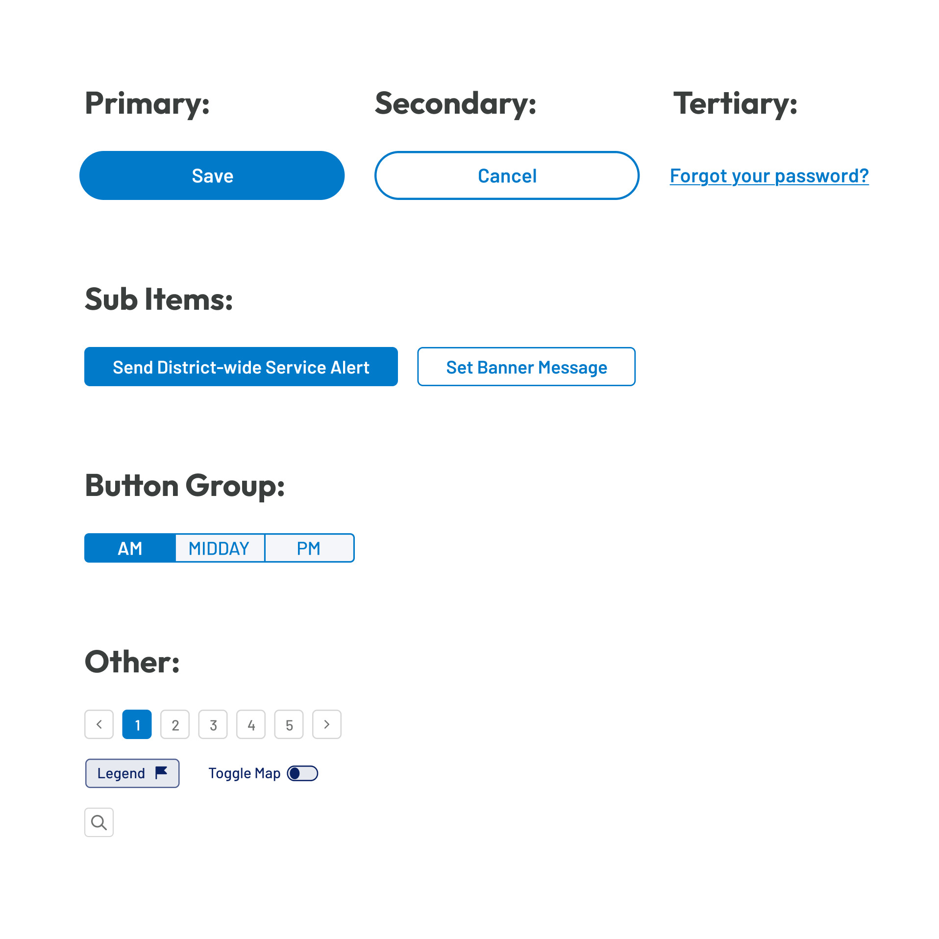
A consistent button system established clear visual hierarchy for primary, secondary, and supporting actions.
Navigation
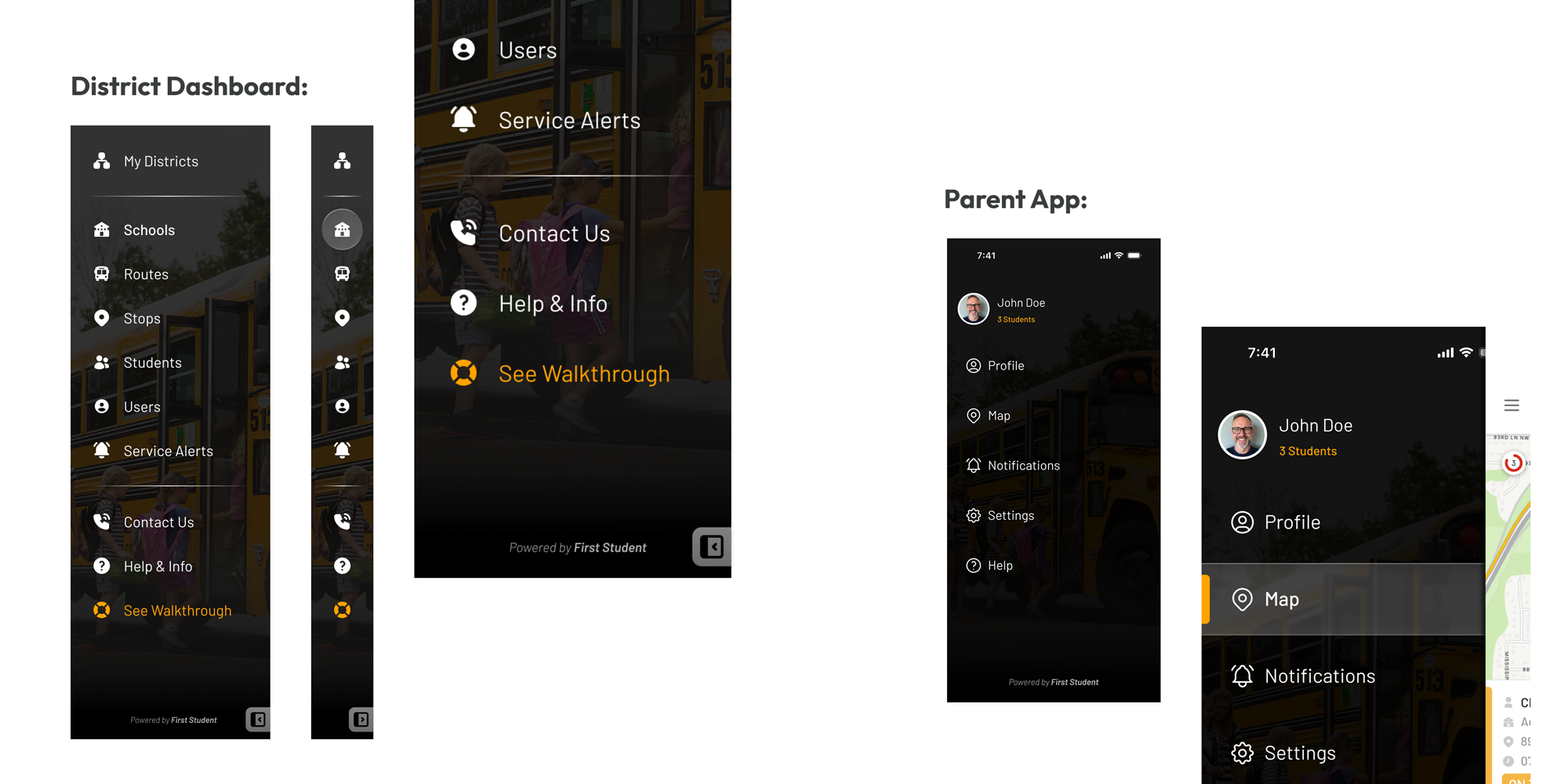
A shared navigation system established consistent interaction patterns across desktop and mobile products. Familiar structure, iconography, and menu organisation reduced learning time while helping users move confidently between key workflows.
Dropdowns
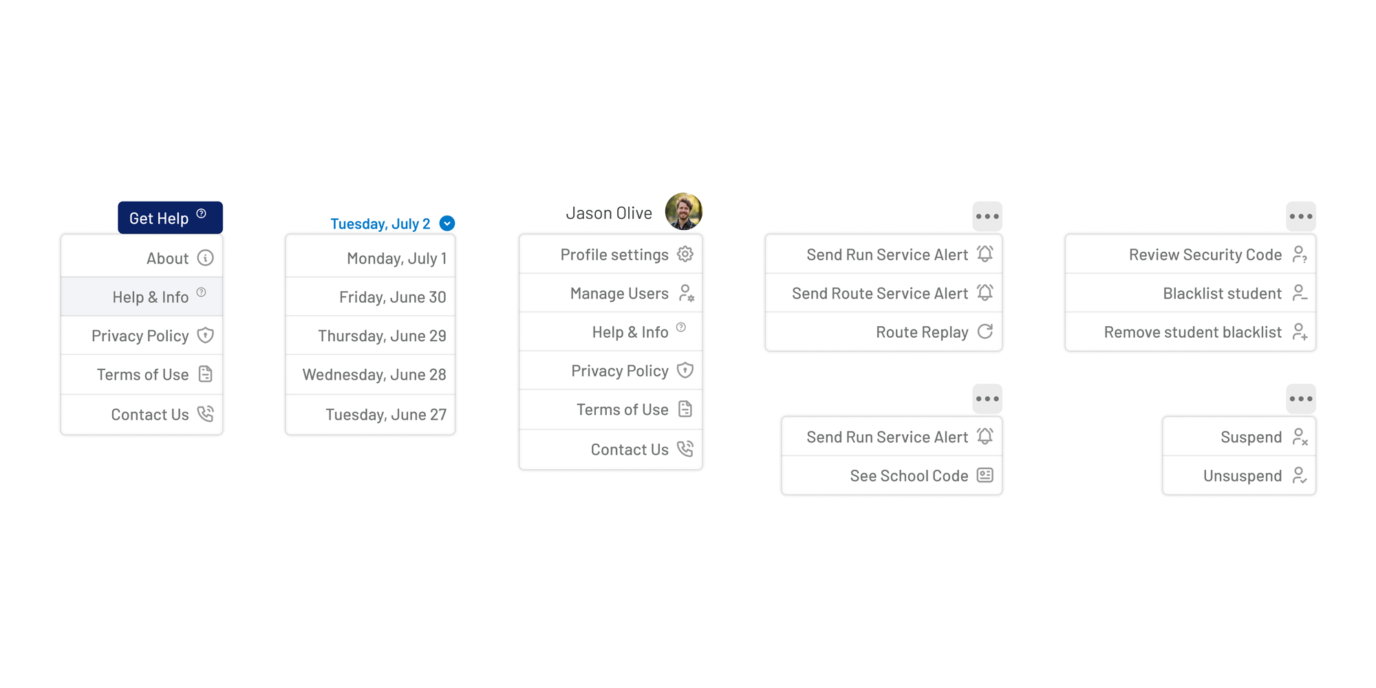
Reusable dropdown components simplified complex operational workflows while keeping dense interfaces organised. Consistent layouts and interaction patterns reduced learning time across different modules.
Operational Components
Status labels
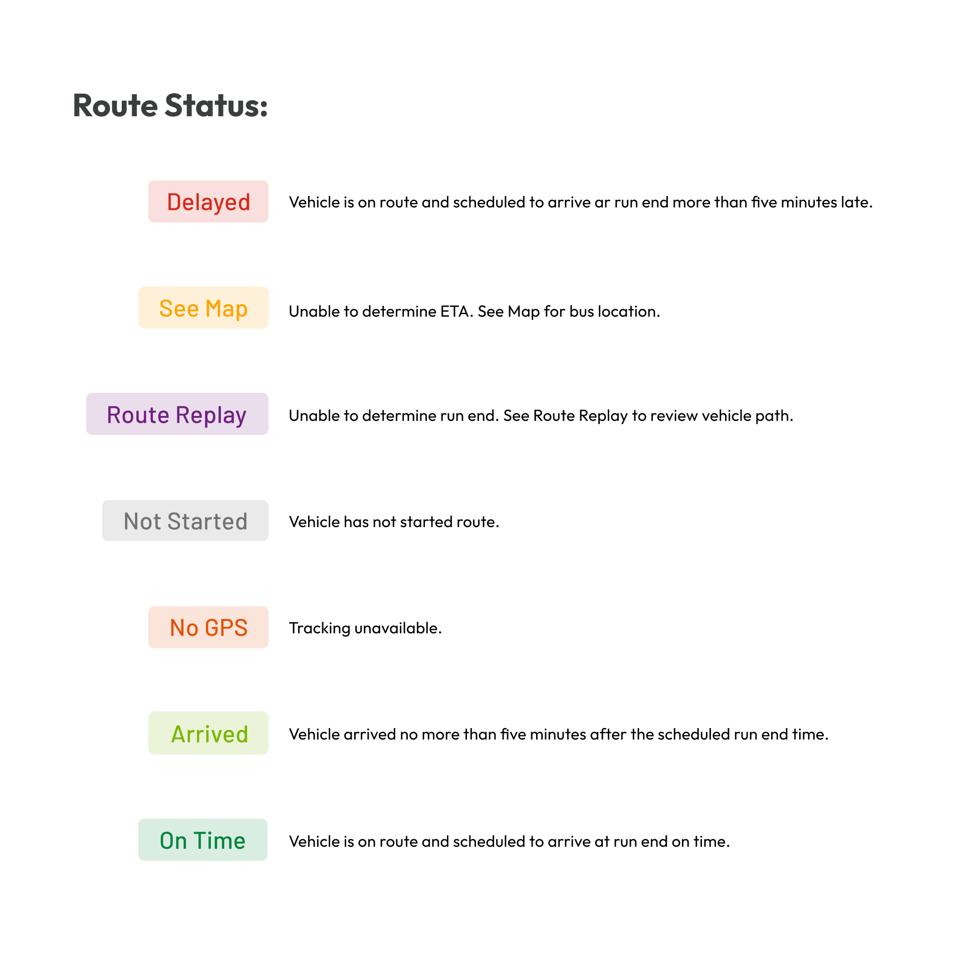
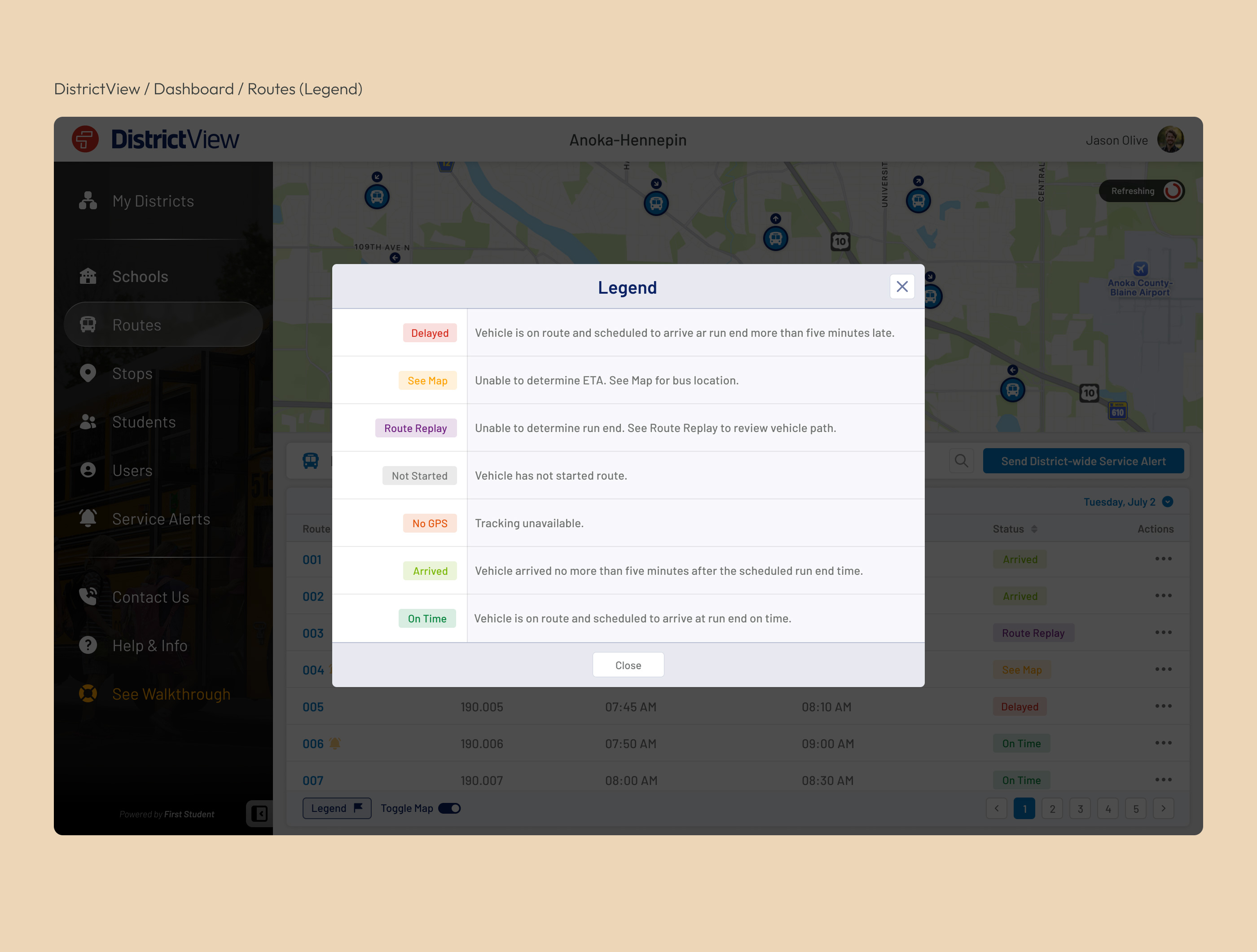
Colour-coded status labels provided immediate visibility into route progress, delays, and operational conditions. Standardised labels enabled users to scan large amounts of information quickly without relying on detailed text.
Push Notifications
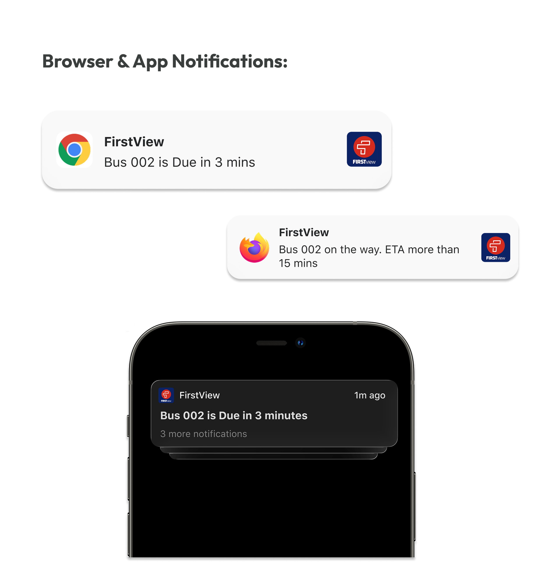
Notification patterns were designed to deliver timely updates without overwhelming users. Consistent messaging and prioritisation ensured parents and administrators received the right information at the right moment.
Alerts
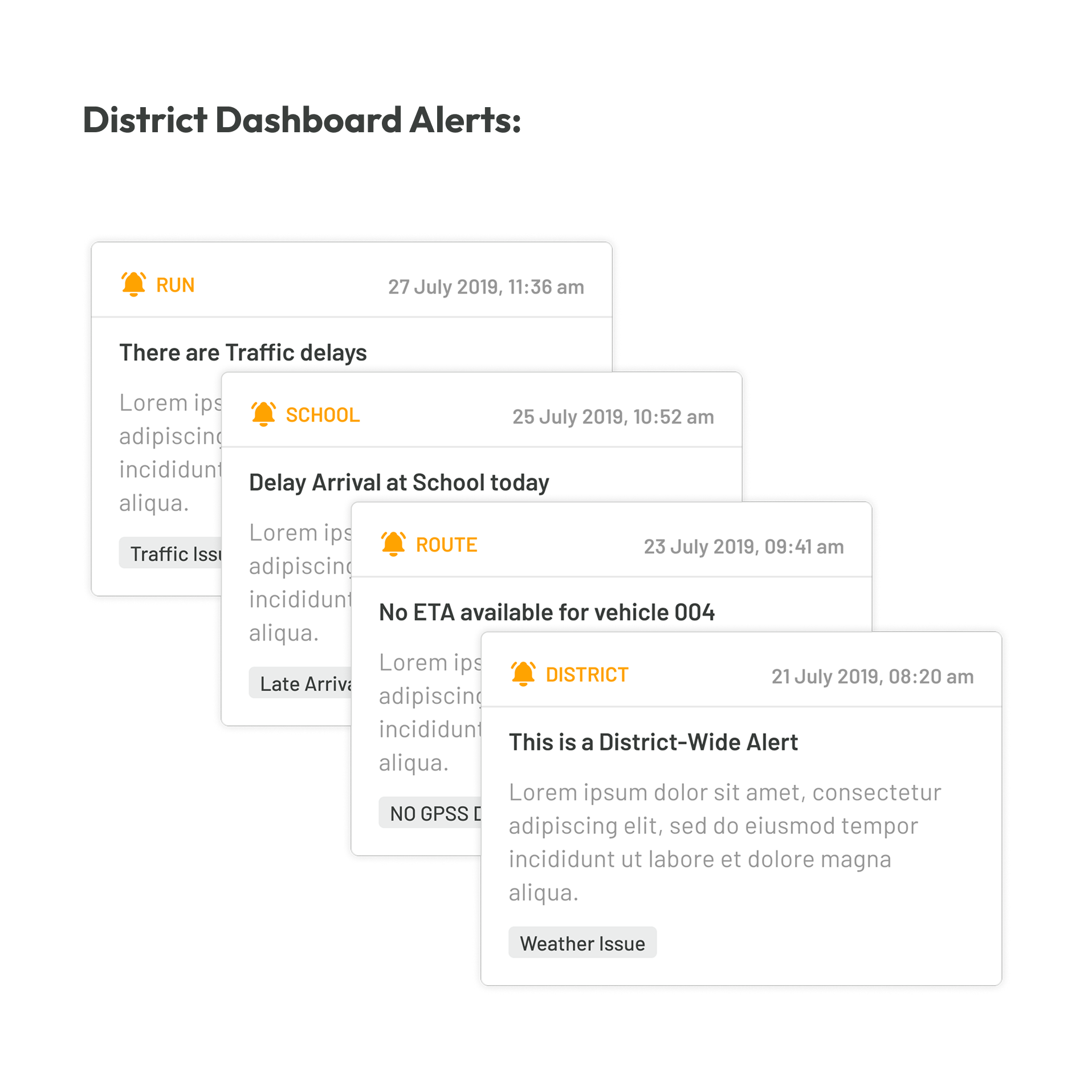
A structured alert system highlighted important operational events requiring immediate attention.
Bus progression
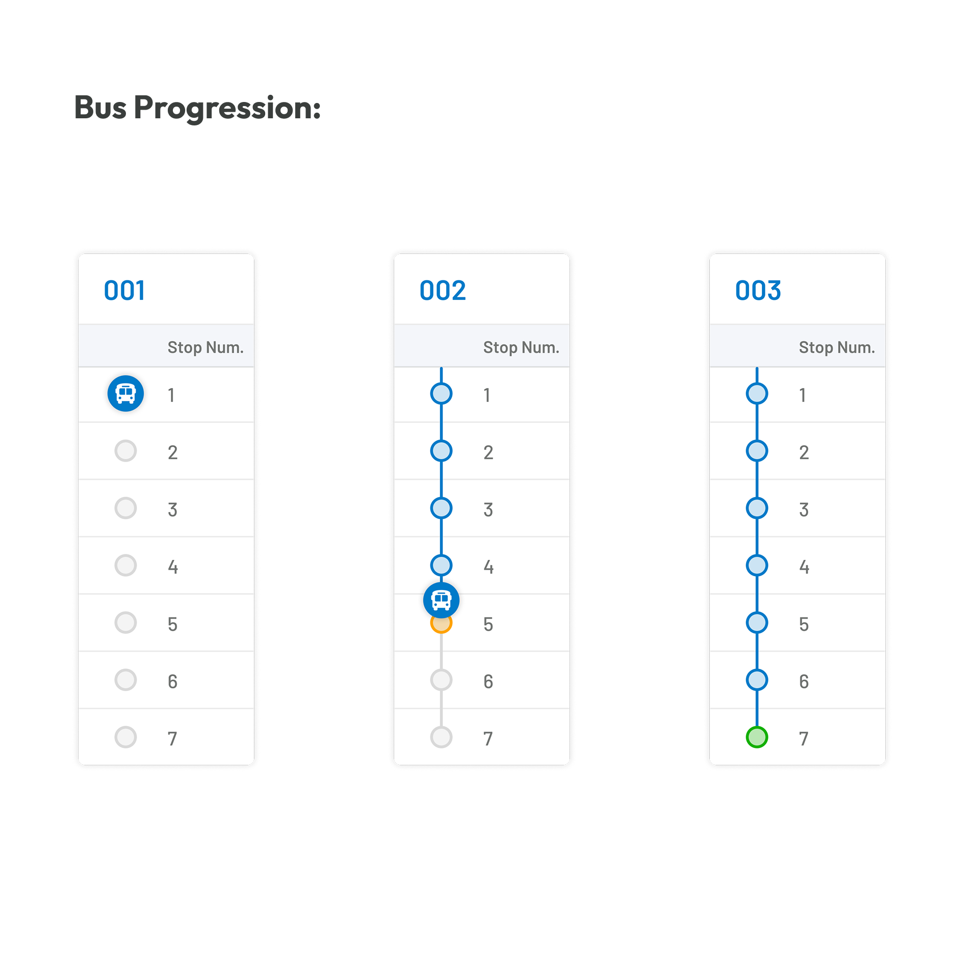
Route progression indicators provided a simple visual representation of each vehicle's journey throughout the day.
Table
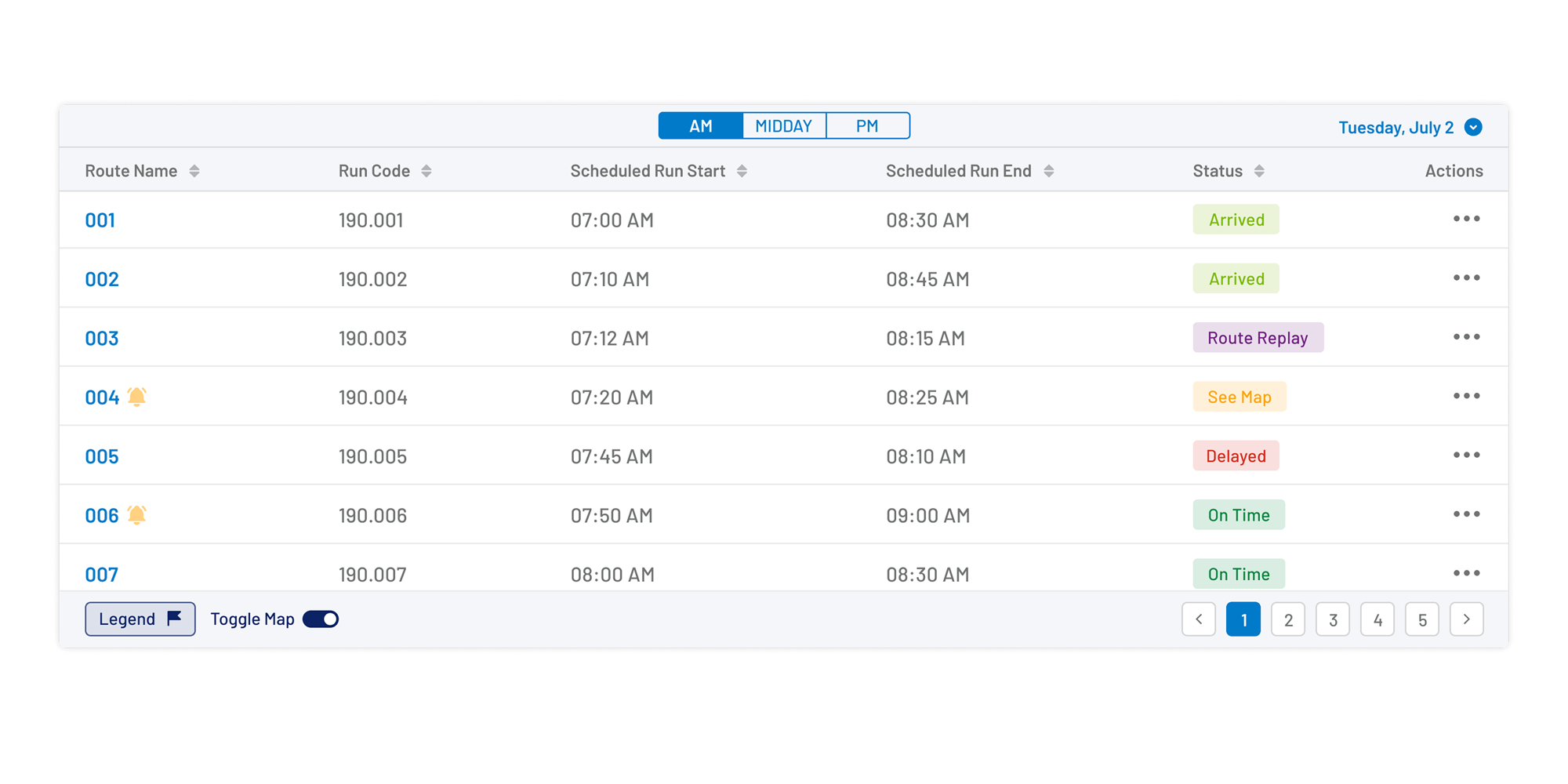
Standardised table components presented high-density operational data in a consistent and scannable format. Sorting, filtering, and status indicators enabled users to manage large datasets efficiently without sacrificing readability.
The Final Experience
After months of research, iterative design, and continuous refinement, the platform evolved into a connected ecosystem supporting districts, schools, administrators, drivers, and parents. The following screens showcase the final product experience, demonstrating how shared design principles, scalable architecture, and user-centred decisions came together across desktop and mobile applications.
Platform Showcase
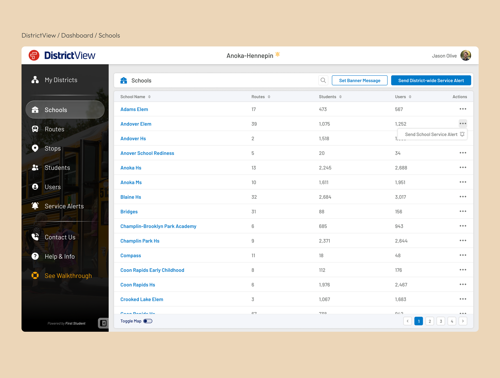
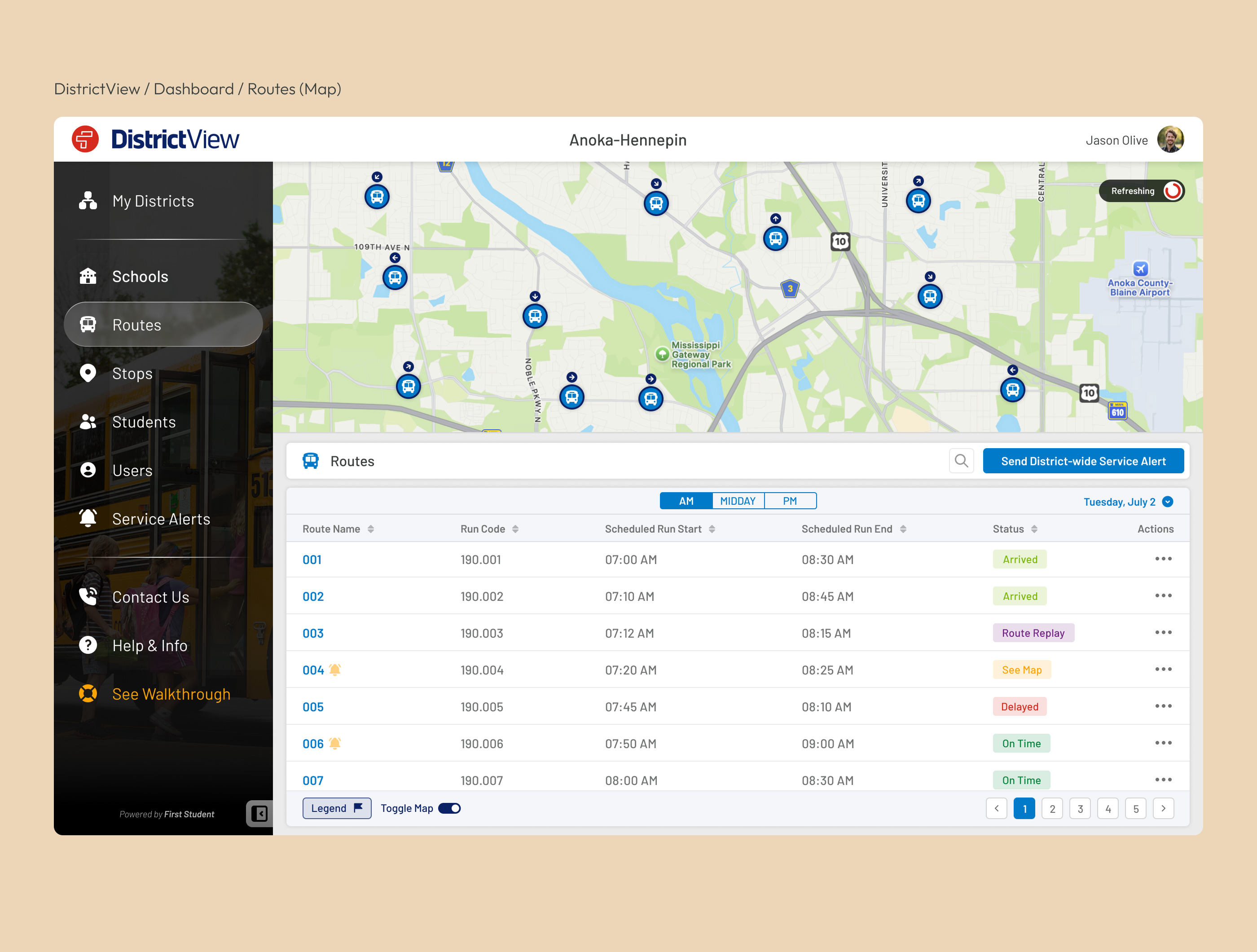
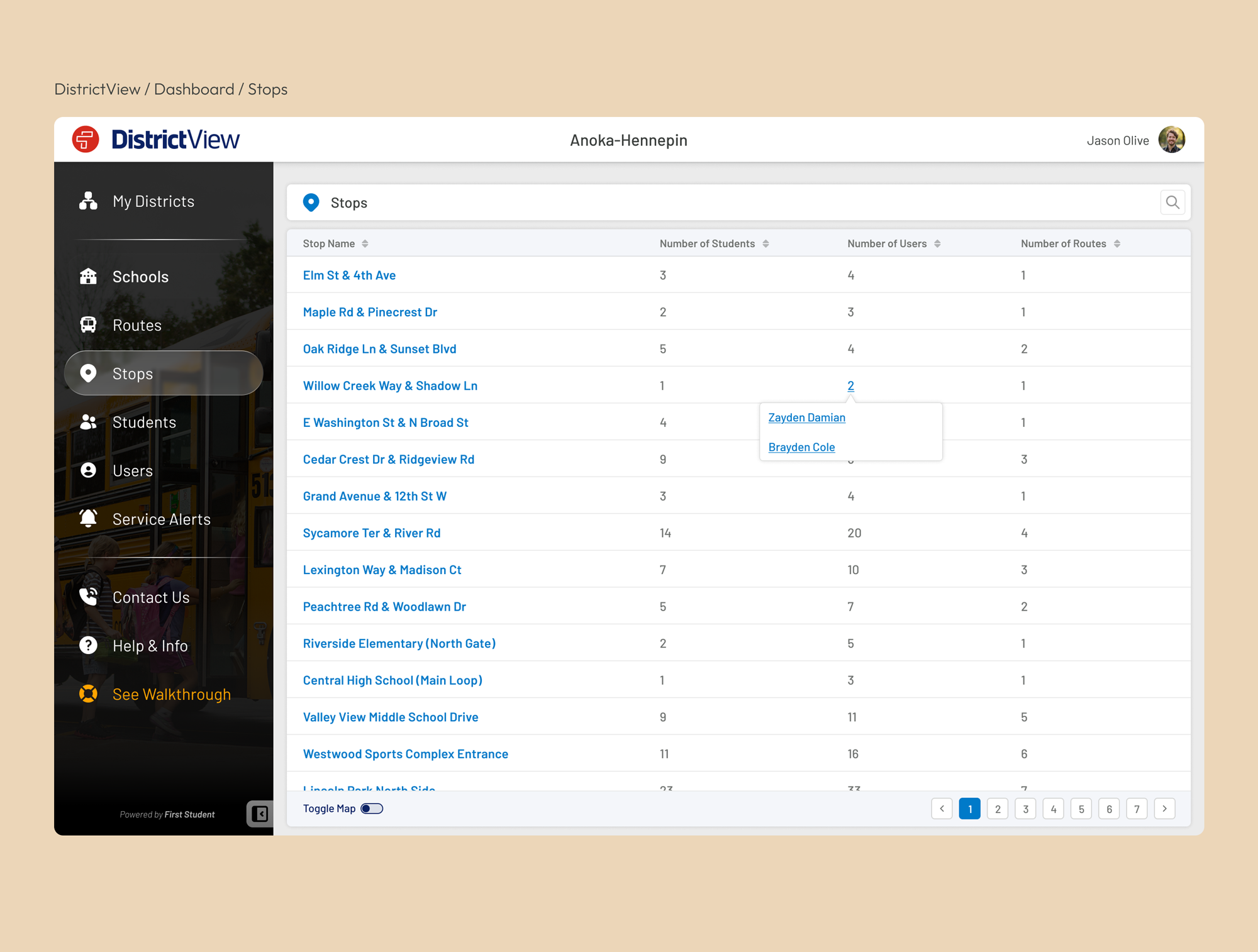
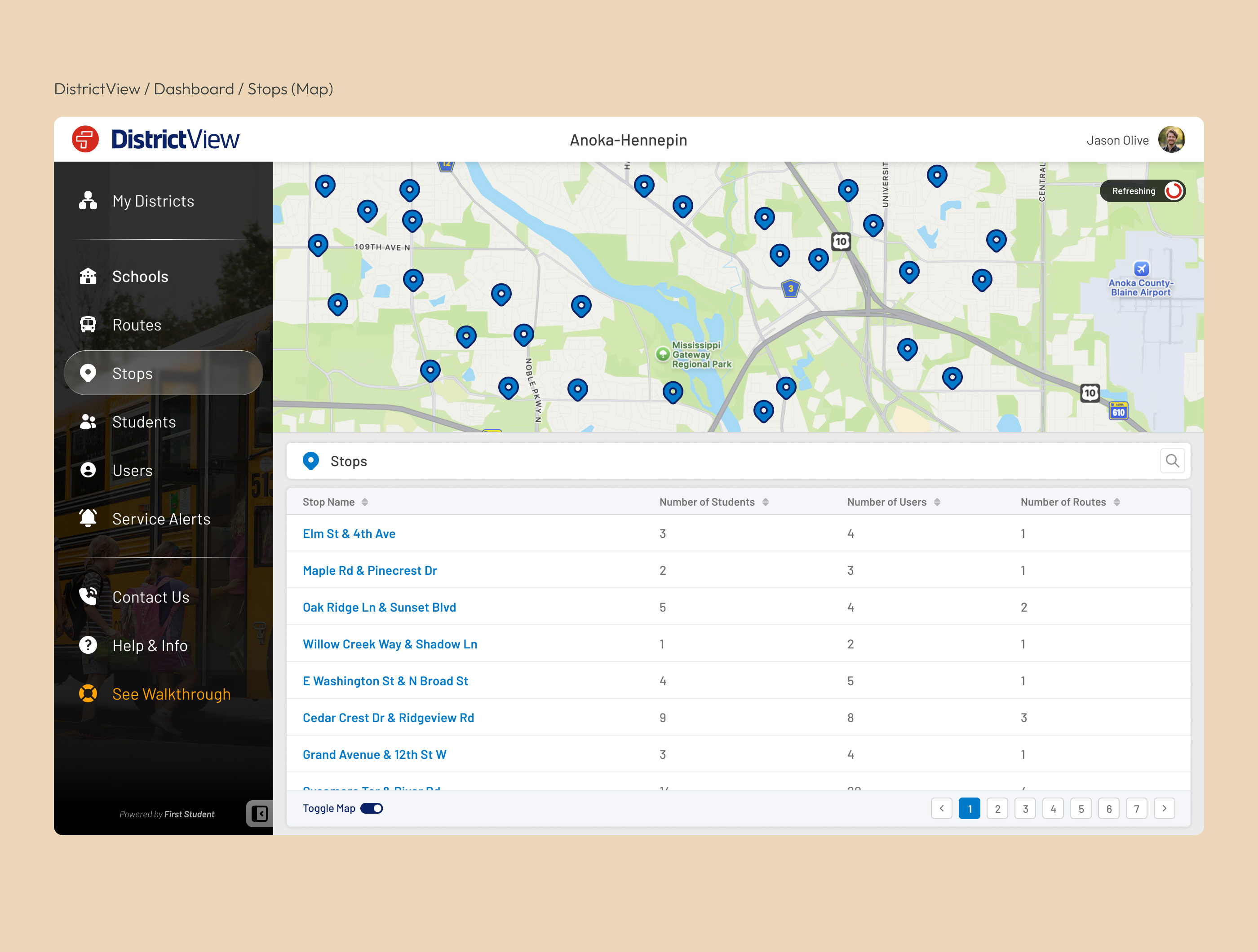
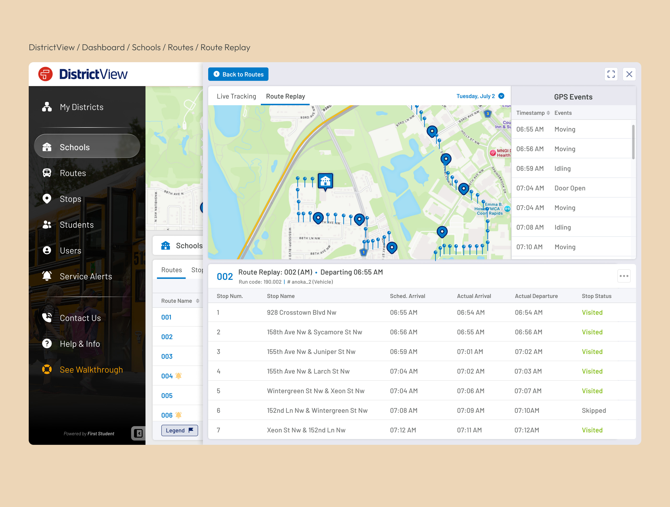
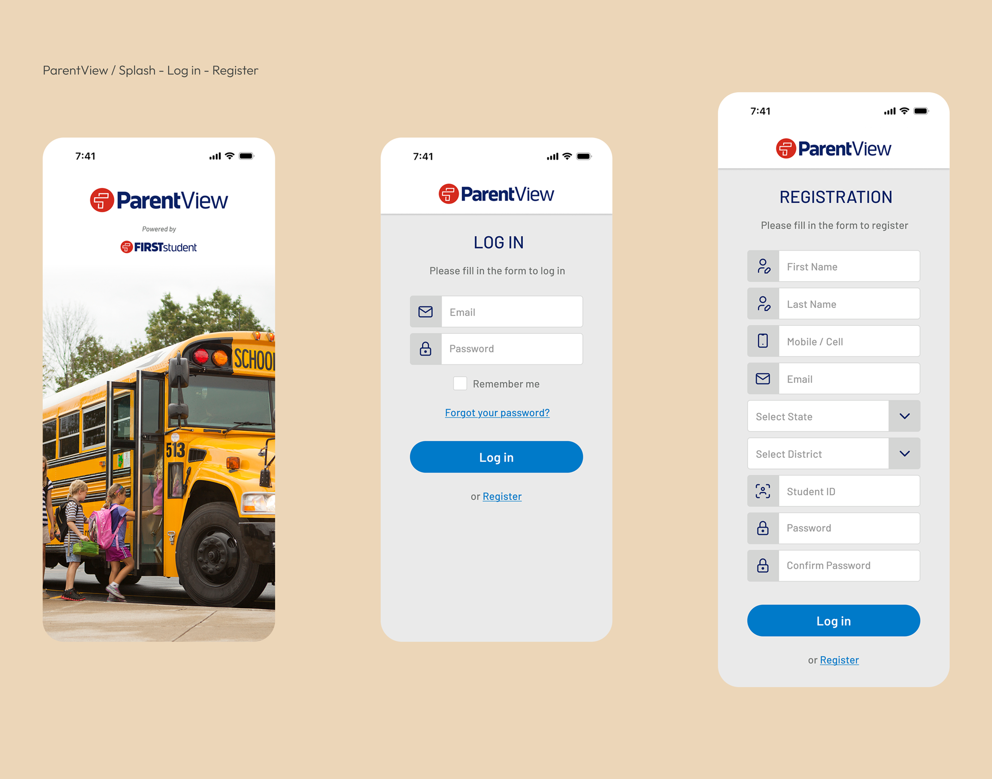
The following gallery showcases representative interfaces from across the platform. Rather than documenting every screen, it focuses on the experiences that best illustrate the product's overall design language.

Access to Platform

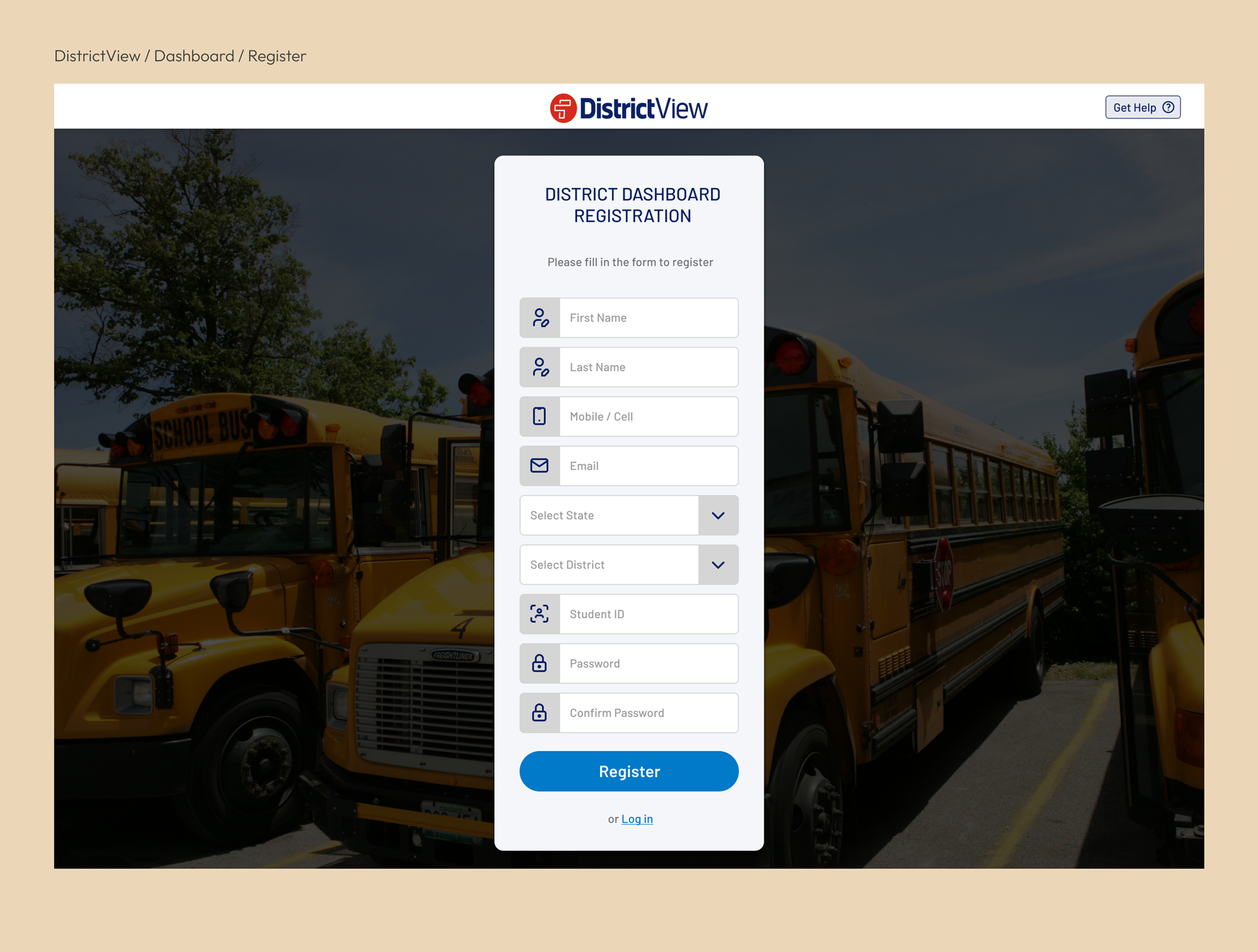
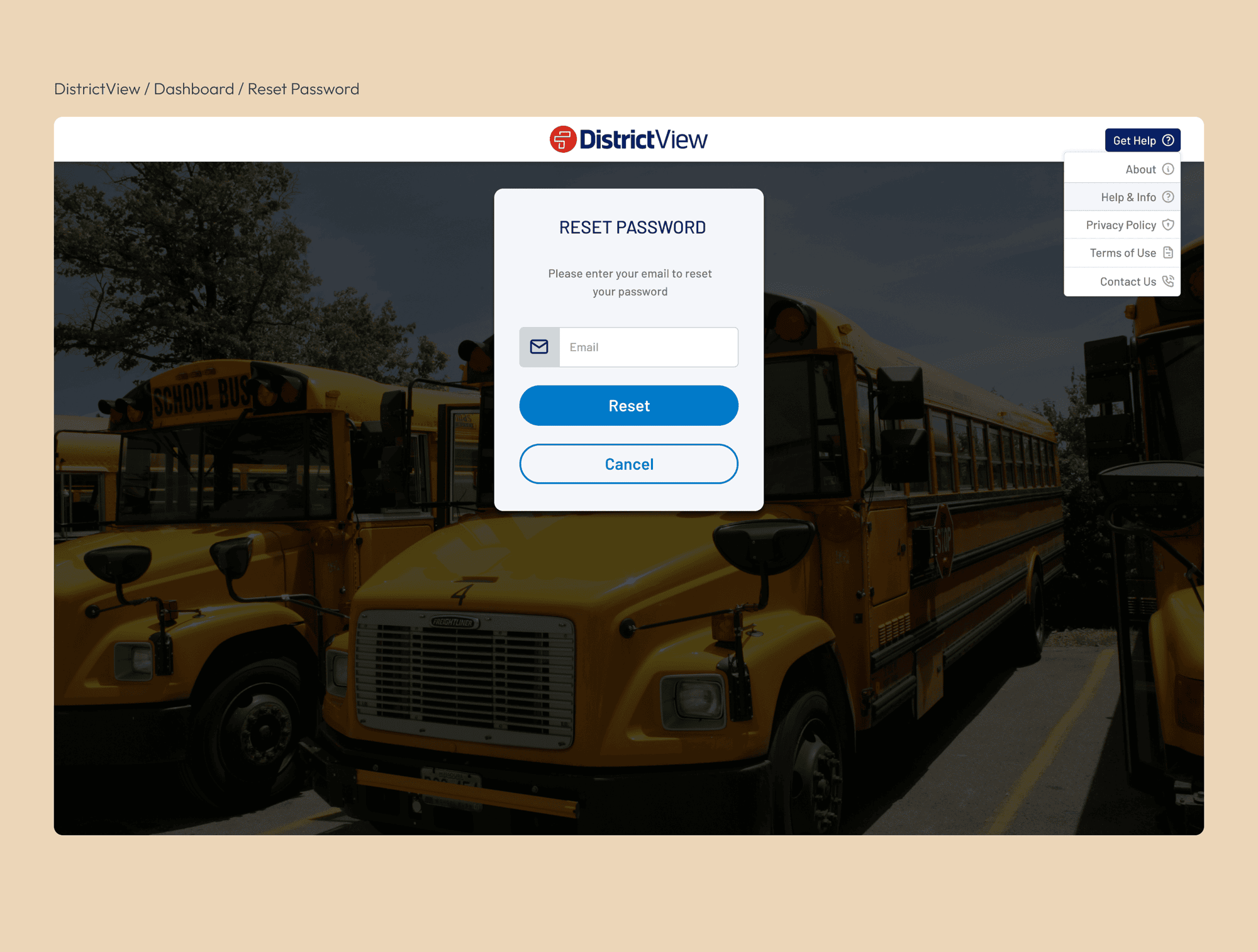
Admin Management
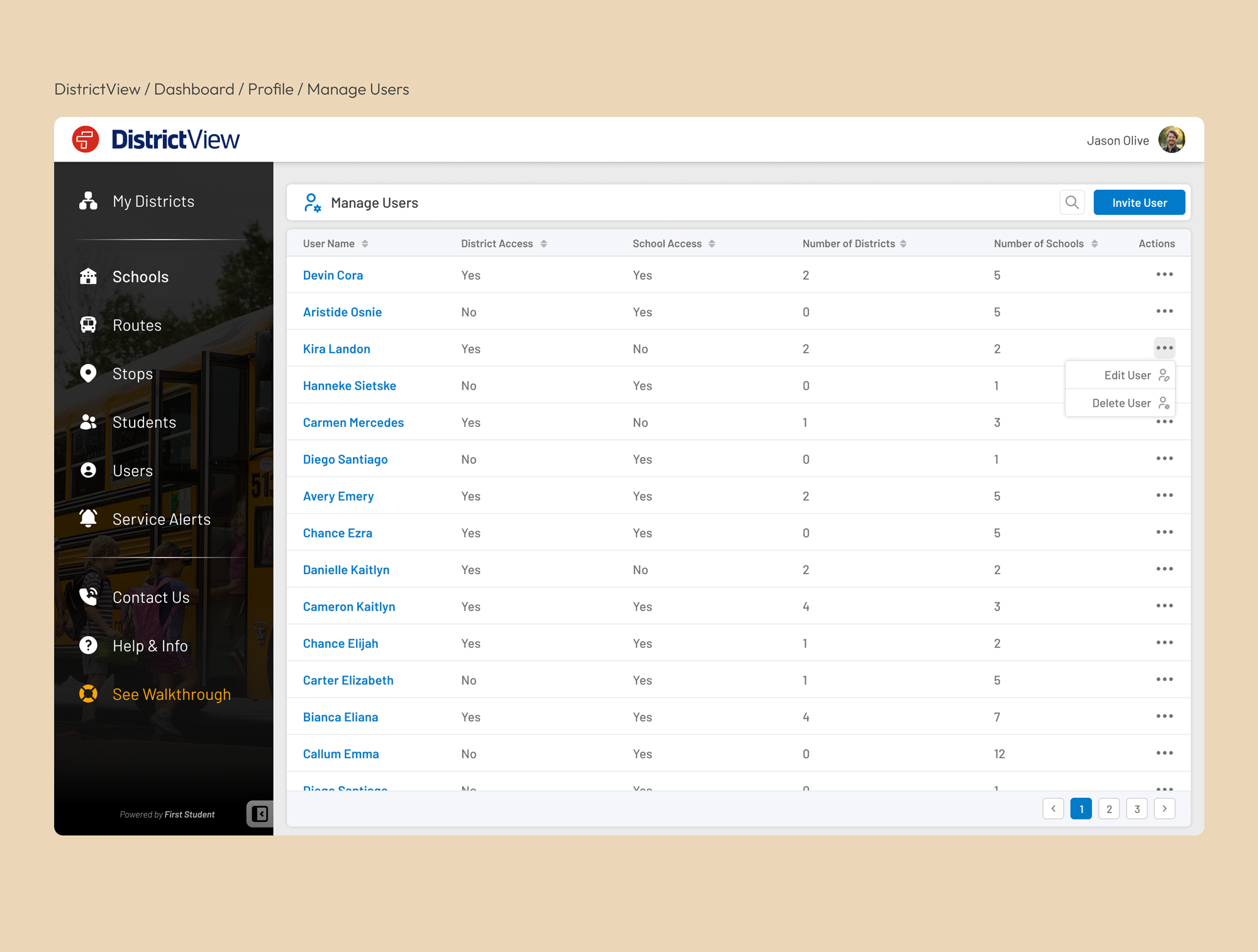
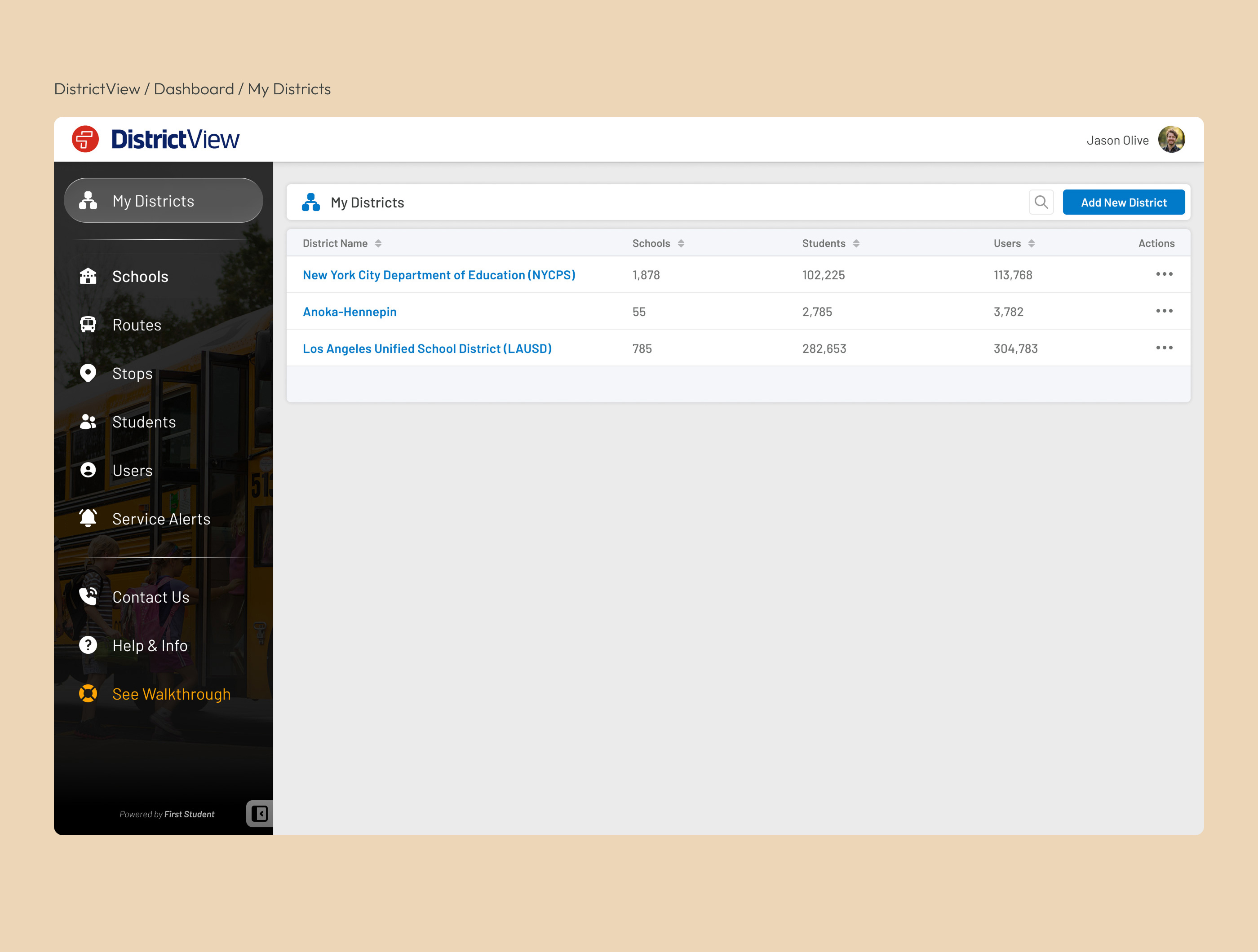
Navigation Items

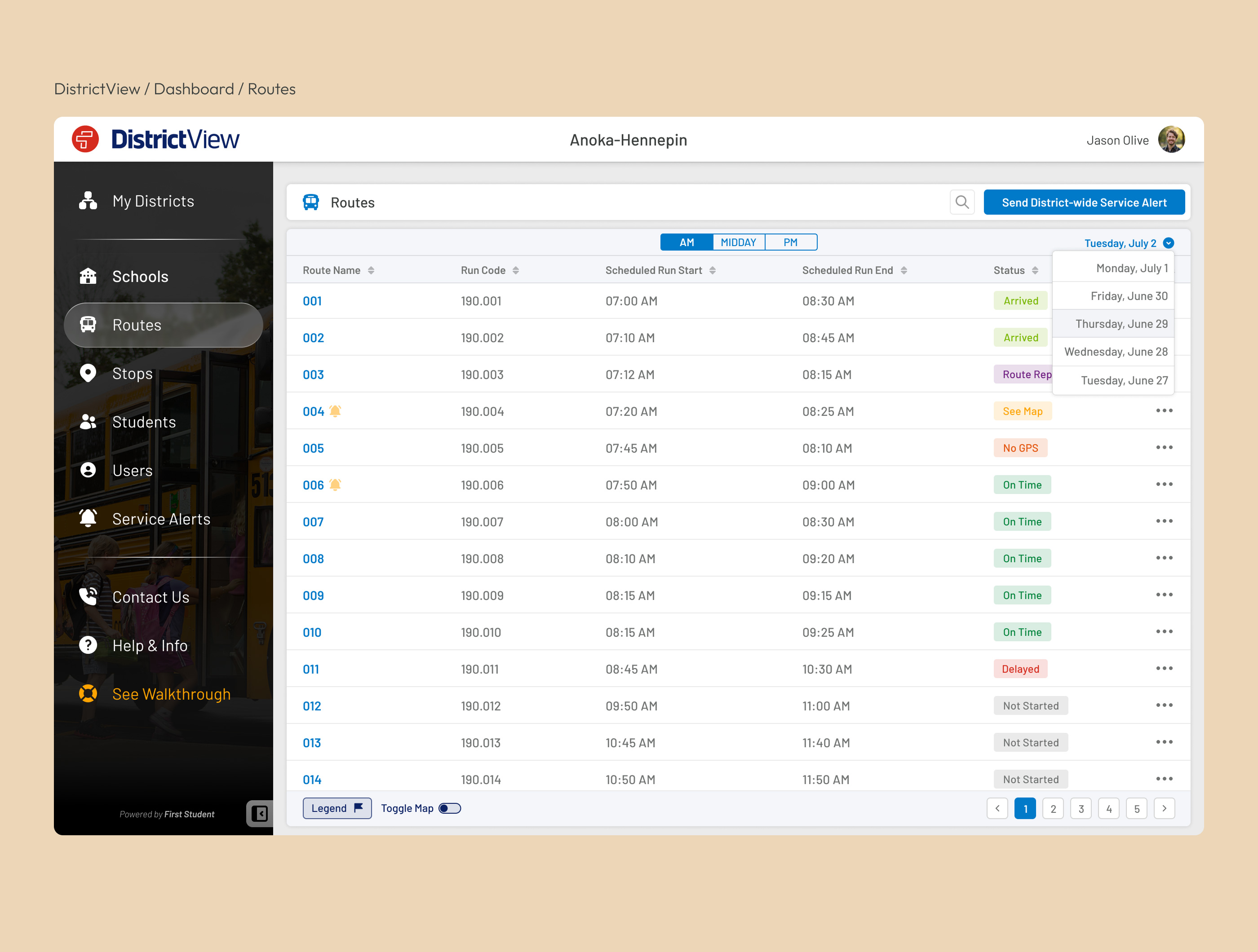
Route Management

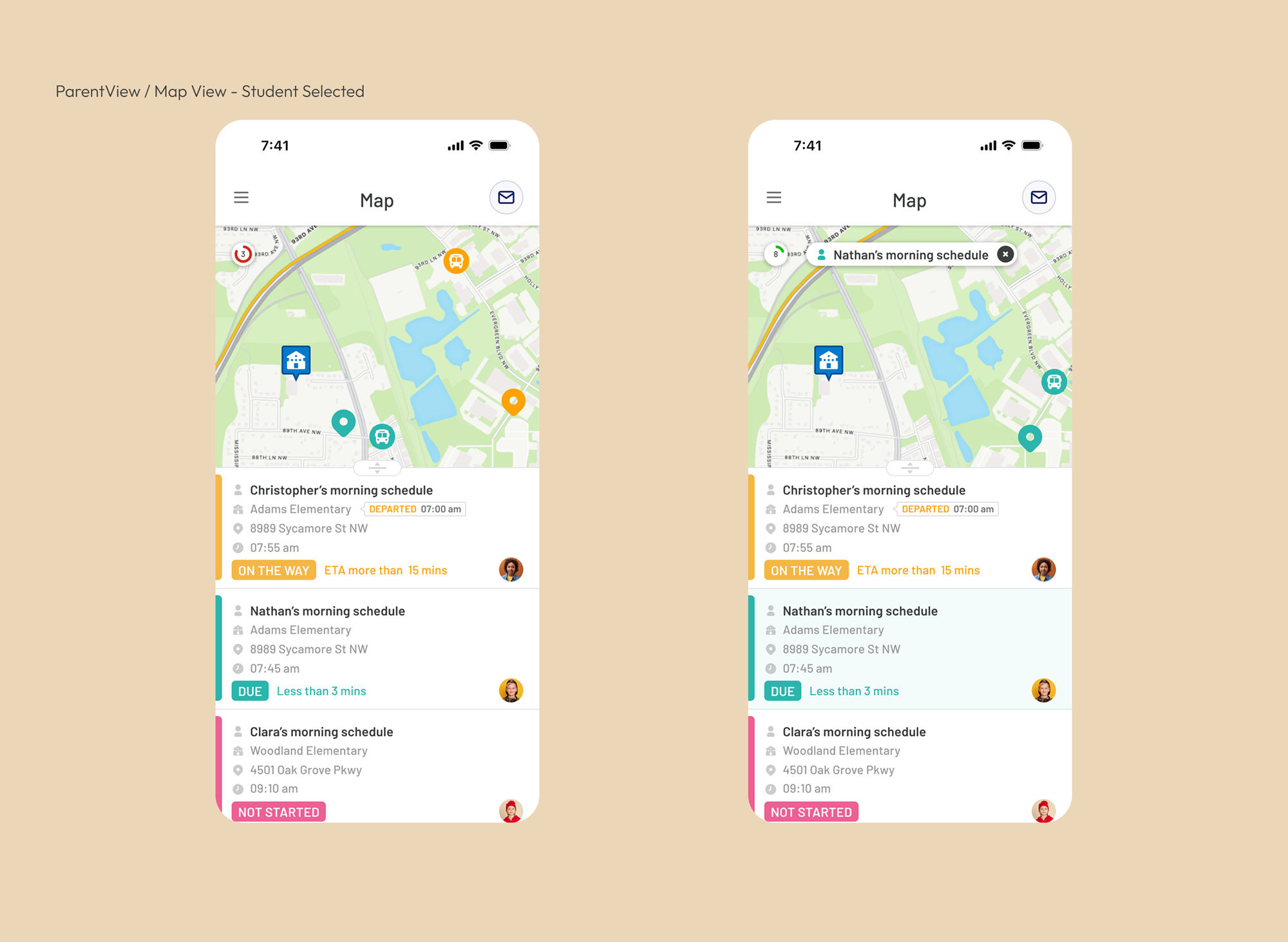
Live Tracking

Student Management

Service Alerts


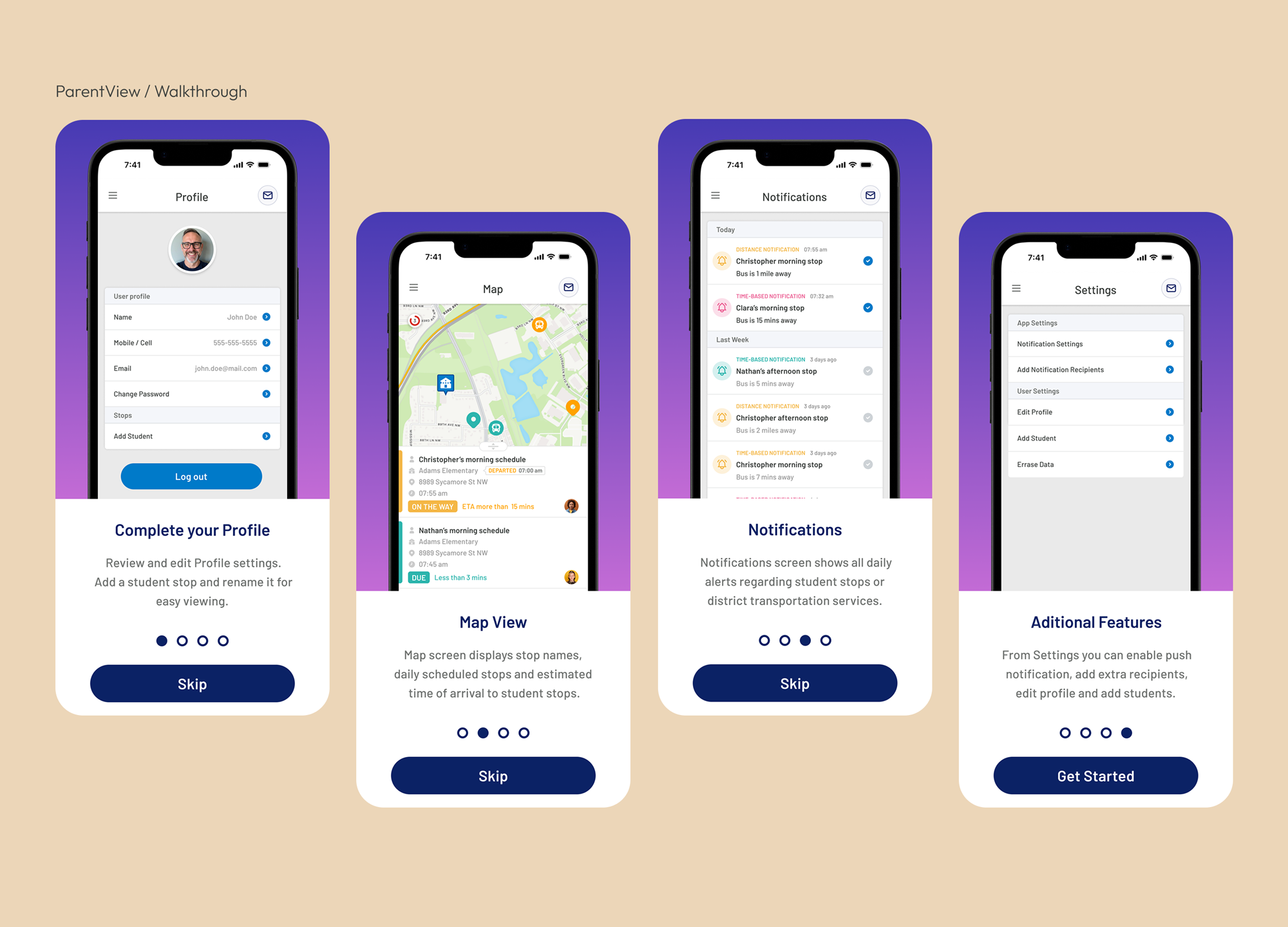
Parent Access
Walkthrough
Navigation

Map (Live Tracking)
App Sections
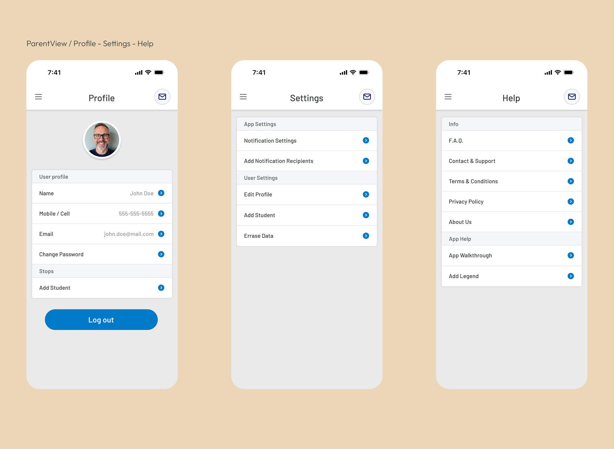
Notifications

Tablet & Mobile
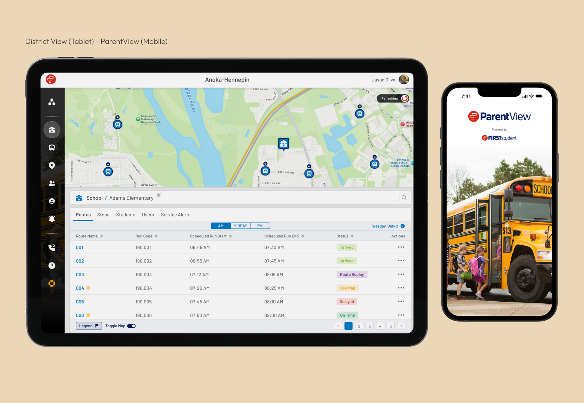
FirstView evolved into a connected transportation platform used daily by districts, schools, drivers, and parents. By combining research, scalable information architecture, reusable design patterns, and iterative refinement, the platform delivered a consistent experience across multiple products while supporting complex operational workflows.
Outcomes
FirstView evolved into a scalable platform supporting school transportation operations across North America. By connecting district administrators with a dedicated parent experience, the product simplified day-to-day operations while improving communication between schools, transport providers, and parents. The design foundations established during this project continued to support the platform as it expanded over time.
School Districts
Vehicles Managed
Students Connected
Reflection
Looking back, FirstView fundamentally changed the way I approach enterprise product design. It taught me that designing enterprise software is rarely about individual screens; it is about understanding complex ecosystems, balancing the needs of multiple user groups, and creating experiences that remain clear despite operational complexity.
Working across desktop and mobile products also reinforced the importance of consistency. Decisions made in one part of the platform often affected another, making shared design patterns and scalable systems just as valuable as individual interface improvements.
More importantly, the project strengthened my belief that successful product design comes from collaboration. Close partnerships with stakeholders, developers, and operational teams allowed design decisions to be grounded in real user needs rather than assumptions. Those lessons continue to influence how I approach every product today.
*Portfolio visuals have been refreshed to better communicate the design decisions while remaining faithful to the original product.
*DistrictView and ParentView logos are trademarks of their respective owners and are displayed for portfolio attribution purposes only.
Trademark & Portfolio Use Notice
This case study presents selected interface designs and product concepts created as part of my work while employed by uTrack Software Solutions on the FirstView platform for First Student.
First Student, FirstView, DistrictView, ParentView, and related logos are trademarks or registered trademarks of their respective owners.
All trademarks, service marks, logos, and brand names are used solely for identification, attribution, and portfolio demonstration purposes. No affiliation, sponsorship, endorsement, or ownership is claimed by this portfolio website or by Carlos Anazco outside of the professional work performed during the original engagement.
UI layouts, workflows, and visual examples shown here are presented exclusively to demonstrate my contribution to the product design process and user experience work.
Enjoyed the case study?
If you're looking for a Senior Product Designer to help shape thoughtful digital products, I'd love to hear about your next challenge.